Elana Herzog - Formally interesting. Old bedspread stretched across a corner, a million silver staples. Nice scrambled-egg color and texture to the coming undone bedspread. The whole thing was on an angled wall that was built on-site, itself sort of stretched across the gallery's actual walls.
Too bad she had to be so close to Katrin Sigudardottir's large floor sculpture. Most of the artists in the show had their own rooms or bigger spaces; the very close proximity of these two works compromised both. Sigurdardottir had two small floor models each in their own very small rooms, it would have been a better presentation for both artists if Sigurdardottir's large piece had been given one of the small rooms, and that room's small model were in this room with the Herzog.
Maix Mayer - He had two videos. It's hard sometimes to just think about the work itself, to consider it on it's own merits, when it is included in thematic exhibitions making elaborate claims. Surface Charge, according to co-curator Gregory Volk (along with Sabine Russ), is supposedly all about turning the "very surfaces into active forces as opposed to neutral supports", with the brochure stating that much of the work was made on-site, specifically for this exhibition, and "will exist only for the duration of the exhibition". I think he used the word "miraculous" in an interview with the Richmond Times-Dispatch. It was frustrating to try and appreciate a video (made in 2003) within this context.
It also took me a little while to realize that the sound I was hearing from one video was actually coming from the artist's other video next door, and vice versa. I had to walk back and forth a few times between the two rooms - separated by a makeshift wall - before I got that the music of the large video wasn't intended to be heard with the smaller video and it's softly murmuring crowd.
....more on the Maix Mayer...
Karina Peisajovich - This was a very popular room at the opening reception, and looks great in the photo on VCU's website, but the initial enchantment lessened with each subsequent visit. Maybe a nice place to have a drink or something, take a nap, have a rack of groovy clothes to sell, make out.
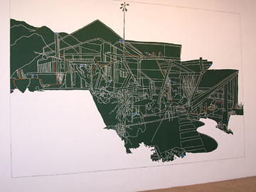
Kim Schoenstadt - She had a big center wall painted chalkboard green, with a white-lined drawing carved into it, flanked by two smaller wall drawings in pencil. The three drawings were all architectural, and interesting in that the big green one up close almost read like a map, with maybe roads and rivers, and from farther back it was like a specific place - maybe a house in Caliornia. You can see this nice place to be, but the closer you walk up to it the more abstract and farther away it becomes.
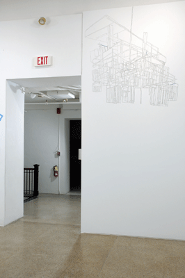
The much smaller pencil drawing on the left, way up near the ceiling, was like a house up close but like a chandelier from farther away; or maybe the diagram of the shadow of a chandelier.
The more I think about this work the more I appreciate all the shifts of scale and space and place, including my own place in the room and wondering where that room exists.
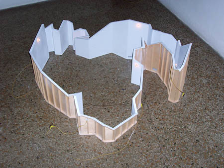
Katrin Sigurdardottir - She showed three floor sculptures, two from 2003 and one dated 2004. My take on these three imported sculptures is similar to (but stronger than) the frustration with the Maix Mayer videos; these pieces not only didn't surface charge anything, they had no relationship to the space whatsoever.
What is the deal? Are the curators to blame for hyping up a show's themes and selecting work that doesn't fit, or did the artist not live up to the curator's expectations?
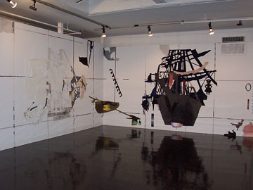
Sally Smart - This piece, The Exquisite Pirate, was so much better on the second visit, without all the people of the opening reception obscuring the view of the floor. Did she know how shiny and reflective the floor would be? Very nice.
The cut-out pirates (and fairy tale-ness, and travel themes) reminded me of the paper cut-outs of Hans Christian Andersen.
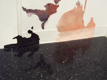
Sally Smart rorschachs.
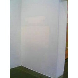
This was one of my favorite Surface Charge moments, arriving one day to find that a bookshelf had been moved so they could paint the wall, leaving a ghostly mirage. This was right around the corner from the Karin Sander, the difference between them being that this was an unexpected delight.
The only artist left to discuss is Laurence Weiner, but I can't because I have no idea what I think - which is an excellent thing. To be confounded is the best.
Elana Herzog always rocks my house. Color me stapled. Pity 'bout the placement.
ReplyDelete