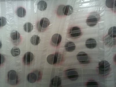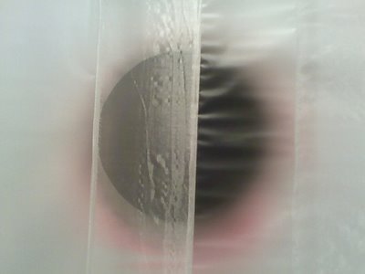
Rachel Hayes' installation for her thesis show. This wall is full of hidden bruises and eclipsed solar flares.

Don't look straight at it.

My favorite of the three Eric Sall paintings in the show. Strange background - the blue border/cave and yellow and brown stripes are in a fight to dominate and recede. The front action looks (to me) like two struggling creatures; actually, they remind me of my fighting One Day in the Garden bugs. The dripping on the curvy black bars is white, not as yellow as it looks here (here is another image of the same painting).
I've enjoyed my few visits to his studio, seeing how he struggles with his paintings. The same painting might still be in process months later, almost unrecognizable. I'm not sure if all that is fun for him, but I like knowing about the process. Eric (seems to) GET everything I WANT - so it is a consolation knowing it isn't easy for him. This painting may be my favorite because it shows all of that struggle - the background is fighting with itself, the foreground is fighting with itself - without showing too much of the labor.
I like this one he had at ATM in Miami.
more photos of Rachel's installation and Eric's paintings are included in this set of work from the 2006 VCU shows.
.
.
No comments:
Post a Comment