Friday, March 30, 2007

Mr. President, at University Art Museum

Okay, last week when I posted Kjartan Slettemark's Nixon Cut Ups I said I'd seen JoAnne Carson and Corinna Ripps Schaming's Mr. President, at SUNY Albany's University Art Museum.... so HERE IT IS!

FIRST... it was noticeable that a show co-curated by two women, featuring work by thirty-two artists, only included three women (with weaker work)... makes me wonder if maybe women artists are not as interested in portraying Presidents? Is it a guy thing? Can anyone think of more women artists who have made President stuff? I can think of a bunch more men who could have been in this show, but no women. Maybe Sue Coe?


Robert Colescott's 1975 painting George Washington Carver Crossing the Delaware. This painting is so complicated... it has clowning around fun and painting exuberance, plus a strong sense of repressed anger. This and the Andrew Lenaghan I think are the best pieces in the show...

I was hoping - but not expecting - to find Guston's Nixon painting, the one that was in the show at the Met a little while back... so to get to see this Colescott made up for that.

Colescott's painting could have easily fit into Mass Moca's Ahistoric Occasion: Artists Making History... that show had a strong appropriation sub-theme.

03-17-07_1538.jpg
Jeffrey Vallance's life-size Nixon sculpture - the gallery attendant said it came naked and they had to put the suit on with him lying on a table, like dressing a corpse. No photos, bummer.

I asked... he is built like a Ken doll.
03-17-07_1524.jpg
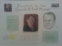
Donation to the Gerald Ford Museum - this piece documents Vallance's effort to donate a ceramic relief bust of Ford to Ford's museum... that thing in the center is a photo of the ceramic, with letters from the museum and some notes.

I love this kind of stuff.. I'm a Jeffrey Vallance fan.
03-17-07_1525.jpg
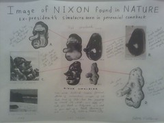
Image of Nixon Found in Nature...

Enrique Chagoya had some Guston "inspired" drawings that might been okay if he had any apparent drawing skills at all... but it was a pretty sad comparison. I don't get how zero original ideas + zero technical ability = inclusion in show. Much better was James Esber...
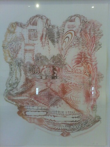
James Esber
James Esber's Nixon drawing had the Guston.

Not the bite though... I mean, Nixon's been out of office for more than thirty years, right? Enrique Chagoya gets some points for trying... if they could be combined together Esber and Chagoya could probably make a kick-ass drawing.

Mmm... actually, I take that back... Esber's Nixon drawing IS a kick-ass drawing. I mean that a Frankenriquesber monster could really DESTROY.

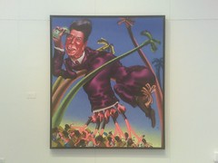
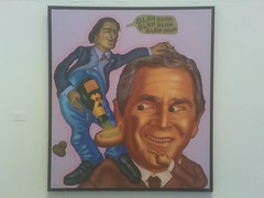
Peter Saul's two paintings were made twenty years apart -
Peter Saul
Peter Saul's Ronald Reagan, painted in 1984... wow, that reminds me of a caricature class I took at Hudson Valley Community College in like 1981(?) or so... It was a night-time continuing education class or something, I was the only kid... I remember we drew Ronald Reagan.
Peter Saul
Peter Saul's George Bush, painted in 2004.
03-17-07_1513.jpg
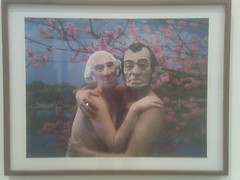
Yasser Aggour - this culture, gender, racial, power switch-up was good... a picture of George and Abe hugging naked under the plum blossoms. This piece is like kabuki to me... the masks are so stylized, and weirdly asian-like... plus they have a heavy make-up feel, and the gender switching thing where a person is playing the opposite sex (George is a woman).
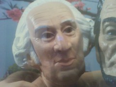
03-17-07_1514.jpg
Doesn't this look like a kabuki thing, a little? I can totally imagine this person moving in kabuki stop-motion style, pausing at a crucial moment.

03-17-07_1559.jpg
Andrew Lenaghan's very big portrait of George Bush II... this is an excellent painting. This is (i feel) the strongest piece in the show, along with the Colescott.

I'M TIRED. maybe i'll update, add some links later. there was more stuff worth sharing.

Good show, overall a bit tame... definitely could have used some more anger, some Robbie Conal, some Sue Coe.


Wednesday, March 28, 2007

kids on free sofa


Kids on the free sofa across the street from my undisclosed location... they are waving at the cars driving by.
kids on free sofa
punks!

Tuesday, March 27, 2007

Ahistoric Occasion: Artists Making History... II

A little more (the first post is here) on Mass Moca's Ahistoric Occasion: Artists Making History, curated by Nato Thompson...

Kerry James Marshall - has a whole bunch of stuff in this show... some images from his P-Van comic, a sculpture, some good prints. I most liked Black Painting (2003-2006)... a very big all black painting of a bedroom. It's hard to make out anything at all, but if you study it you can see a couple in bed, the black power fist on a poster on the wall, a black panther lamp... everything is discernible except for the guys head and face, which I totally couldn't get a handle on from any angle. He is invisible. Here is a picture of the painting in progress.
I like that painting for itself, but also because I relate it to one of Horace Pippin's paintings, West Chester Court House... in which Pippin has represented the statue in front of the courthouse, Old Glory, a statue of a Civil War soldier holding the American flag, as a sort of black avenger.

Horace Pippin
Pippin is one of my favorites... this is as big as I can figure out how to make this image... I wanted to make it bigger.

Paul Chan - is showing his Henry Darger-inspired video, Happiness (finally) after 35,000 Years of Civilization - after Henry Darger and Charles Fourier (2000)... plus filled with many other art references - like Goya/Chapman Brothers, Mario Bros/Arcangel clouds, Breughel's tower, that famous Vietnam-war photo of the naked girl running toward the camera, one scene looked like Roger Brown. Roberta Smith called this video "brilliantly imagined"... but... is it really? How? Sorry, no. It's definitely way more interesting than the charcoal drawings he is showing though.

immediate update: I did very much like the way Chan's piece was displayed, hanging from the ceiling with the video watchable from either side. That's the same way they had some of Darger's double-sided works hanging when I saw them at the Watari-Um... and at the Shiseido space in Ginza in 1997 (ten years ago, FUCK!). There is definitely a little Darger in my One Day in the Garden piece.

I can't believe that Paul Chan vs. the student thing... go to this blog post and scroll down to get the story, and to read Paul's response in the comments.

They are talking about the work reviewed in the excerpt below -

"The banner outside the Serpentine Gallery's group show of young Americans artists simply reads: "Mission Accomplished". By compressing into two words all the cynicism and contempt so many Americans feel for their president, the artist Paul Chan suavely disassociates American art from American policies and so disarms the potentially hostile audience likely to visit the show."

Some of this related type stuff came up in the comments of Winkleman's recent Taking Pictures in Galleries post.

Jeremy Deller - regretfully, not enough time after everything else in this huge museum to spend with Jeremy Deller's two videos.

RELATED: I haven't seen EVERY Mass Moca show, but I've seen a bunch. Here is a short alphabetical listing of my favorite Mass Moca shows -

Tim Hawkinson's Uber Organ - this is right now in a show that just opened at the Getty, but i can't imagine it being in a better space than it had at Mass Moca. i recently read that Inopportune, Cai Guo-Qiang's flying car piece i saw in this same huge space and didn't like, is now in the lobby of the Seattle Art Museum.
Oyvind Fahlstrom - i was lucky to see this.
Jarvis Rockwell - wow... it was so bizarre; and he's the son of Norman.
Ann Sofi-Siden - i had the blog at this time.

Mass Moca has a show opening in April that looks like it will be good.... The Believers.

Sunday, March 25, 2007

Leslie Hall... Leslie and the Ly's


photo by Megan Leners.

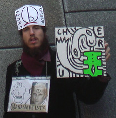
Leslie Hall - performance artist, comedian, musician, painter (maybe former painter), curator, internet everything. Wow... she is awesome, like (b)ananartista... I am so impressed by these artists.

Gem Sweaters - here is the Gem Sweaters video. I think this is what set her on internet fire.
Myspace page with more music is here - the band is called Leslie and the Ly's. the photo above is from her myspace page, a fan/friend took it.

RELATED: Leslie Hall, Keeper of the Gems - on net neutrality. Peter Pan - on net neutrality. Tron Guy - on net neutrality.

Saturday, March 24, 2007

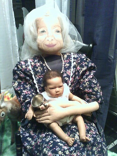
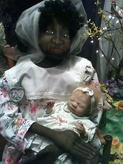
in a shop window

in a shop window
so freaky. what is it? is this normal?

in a shop window
there are two, here is the other one. her hands are like a mummy's. this is a strange shop... i will have to go back in the daytime.

Thursday, March 22, 2007

Painting as Paradox, Remembered... PLUS Jered Sprecher opening tonite

Remember Lauri Firstenberg's Painting As Paradox? I was in the States from Japan doing a residency at the Vermont Studio Center, came down to NYC to see Painting as Paradox, meet with Luis Camnitzer at the Drawing Center (he didn't like my stuff, but was very good)... see some other shows. I saw Thomas Hirschhorn's Cavemanman on that visit.

The Artists Space show, Painting as Paradox, was all over the place.. I remember being surprised that I was not impressed with what was shown, thinking.. this is New York?... and can't recall any specific pieces now except, um, David Nicholson's. It's funny to read that list of included artists and see how some of them have become much better known, that many of them remain unknown (to me).. and also to think about all of those painters who are now well-known but were not at that time, and aren't in the show. So much changes in just five years, less than five years... closer to four years.

Here is the NYTimes review, here is the Jerry Saltz review.

What was at the Drawing Center at that time? I remember not liking it, or not getting it... okay, I just looked it up.. HERE it is.

THERE ARE SO MANY ARTISTS.

almost immediate update: I also saw Drawing Now , in Queens, on that visit.

PLUS! Jered Sprecher
has a show opening TONIGHT at Jeff Bailey...

Jered Sprecher
The last time I posted Jered's work, there were some good comments, so I'll re-post them now -

Anonymous said...
It looked like he worked really hard on those, what technique.Ada really knows how to find them. Sorry for my sarcasm but I am still reeling from reading about Saatchi buying an Eric Sall for 12g's in Miami. It's for a show called "Crappy Looking Expensive Paintings". I am so bitter... Mr.Bitter

vc said...
I like them: THe ptgs in this post more than most of those in the link. I can't tell anything about technique in this photo, but I look forward to seeing them. Unless Mr. Bitter refers to Sprecher's laxness: he doesn't need to pretty things up.kind of a Raoul De Keyser / Giorgio Morandi vibe, which seems to be popular nowadays -- the easily discernible, but never air-tight visual system, the low-key colors and generally contemplative experience. This of course gaurantees nothing.Mr. Bitter, if you are permanently bitter, 24/7, like I am, it kind of stops being an issue. I think Sphrecher is quite different from Sall.

vc said...
But maybe they do wear a little thin after a while. There is a certain cleverness in some of them.

Anonymous said...
I am the captain of bitter, only this guy Martin might be more bitter.Thanks for your post, I now have a new comment" Hey Jered! Stop ripping off Raoul De Keyser!"yours truly-Mr.Bitter p.s. I think I like Sprecher more than Sall.

martin said...
ADA... and find them and find them and find them.I generally like Eric's paintings, and am not surprised by the Saatchi purchase. He's been very very fortunate. I'm not bitter about it, definitely don't think his work is crappy or too expensive, but it is easy to feel frustrated and jealous (not specifically of Eric, just in general).mr. bitter - i am not more bitter than you, sorry.

vc said...
I think my De Keyser comment was of limited value, as are all comparisons. I don't think it's a case of ripping off, but more of a. . . zeitgeist? of anti-bombastid painting. My statement of bitterness was not directed against anyone in particular. I think it is just an undeniable reaction. It does not prevent anyone from making valid criticisms, provided we don't pretend to be objective.

Anonymous said...
Then I win! I am the most bitter. I like to see realism, or at least a show of talent.I question the skill level of some of these artist.Ada has a salon show up at Plant Zero right now and its half crap. I am not knocking everyone there. There is some definite real talent there.Up close some pieces were not up to gallery grade by a mile. I could probably learn something from you vc.

Anonymous said...
yum gallery grade, its what i put in my car everytime i fill up. i think Sall is alright, definately not earthshattering or anything but not bad. expensive? nah, we should all ask more. you know VC i think the Sprechers will wear thin and quickly, perhaps if we could see a lot of them at once they would grow on us but i'm not sure.

Wednesday, March 21, 2007

Ahistoric Occasion: Artists Making History

Ahistoric Occasion: Artists Making History, at Mass Moca.... some highlights and thoughts -

Dario Robleto - this is the first time I've been into some of Dario Robleto's stuff... the stuff from the 2004 Whitney Biennial (the first time I saw his work) has left a strong impression, mostly I was boggled at the list of ingredients, I mean materials... but don't remember being especially into it. Also saw his big show at the Weatherspoon, and wasn't into that one at all, by the time of that visit the ingredients surprise was gone for me, plus the installation/space wasn't very good; but the artists I went with liked his work a lot.

At Mass Moca he has a nice, well-curated room to himself, and there are a few things here that I liked...


War Pigeon With a Message (Love Survives the Death of Cells), 2002 - it's a REAL pigeon skeleton in REAL rubble, with a REAL bullet in the rubble, and a REAL pigeon ID band around the pigeon leg... there is a little scroll, undelivered and unopened, in the pigeons "hand".

It's a simple (sweet) little sculpture... it isn't even necessary to know that the rubble is from the Berlin Wall, the bullet is from WWI, or that the pigeon ID band is WWII-era... although I do like the war mashup.

The scroll is made from "pulp composed of bone dust from a human rib cage and a shredded letter from the Civil War"; the shredded letter is from a Union wife to a Confederate General, begging for the release of her POW husband. Okay, so he did do the ingredients thing again, but he didn't go overboard... it isn't so much that it becomes distracting.

I feel a little weird about the shredding of the original letter, it seems wrong. I guess if Dario is fine with the idea of someone eventually making something from "pulp made from shredded ground Dario Robleto sculpture", it's ok? But not this sculpture, this is a nice one, use one of the overdone ones.

Dario Robleto
The Creative Potential of Disease, 2004

I like this one... if I remember correctly, it's a little one-legged self-portait doll, made by a recuperating Civil War soldier, after his right leg had been amputated; a little totem.

Dario has given him a new cast leg made from "femur bone dust and prosthetic alginate", and mended his pants with material made from modern day soldier's uniforms. I don't know what to make of Dario, is there an artist more treacly and fetishistic? I'm sort of wanting to picture him in dark cemetaries, digging up graves for future projects.

Can you imagine being on your deathbed and YOUR SON Dario Robleto visits??? Scissors in hand, cutting pieces from your hospital gown, snipping locks of hair? Shudder.

Felix Gmelin - this was very good, he had two little movies projected side by side, both apparently filmed from the back of a moving vehicle, of a kind of relay-race of people running through the streets carrying a flag, passing the flag off to each new runner. One film was obviously old, from the sixties or early seventies, and one was new. At the end of the films, the last runner veers off course into a builing, disappears for a little bit... and then re-appears on an upper floor balcony and hangs the flag. The new film is an obvious re-enactment of the old one.

Farbtest, Die Rote Fahne II (2002) is the name of the piece... meaning Color Test, The Red Flag. The old movie, the first color test, was made in Berlin by Gerd Conradt, in 1968, and the flag they are running through the streets is the red flag of Communism. The present day action, filmed in Stockholm, is meaningless. As stated on the Mass Moca website, the reenactment feels like a pale, sad shadow of the first. The flag is devoid of meaning, the re-enactment utterly lacking energy and conviction.

Felix Gmelin's father is one of the runners in the original film. Also very interesting, the credits on the '68 film list a director (Conradt), a camerman, and fourteen runners... while the 2004 re-enactment, which looks pretty much the same, listed a director (Gmelin) and cameraman, plus a camera assistant, a production assistant, an editing person, two production designers, three people listed for production, all of the runners, as well as a number of sponsor$ and supporters. Definitely, with this smart work, the label is an important part of the piece.

I can't figure out why, if there is even a reason, the original film lists fourteen runners, and the 2004 re-enactment lists fifteen.

TIME OUT... this post is getting longer than I had planned... I'll continue with more later.

Monday, March 19, 2007

Kjartan Slettemark


Saturday we saw Mr. President at SUNY Albany's University Art Museum... it was good... I'll post on it later, but first I want to show some work by an artist not included in the show, Kjartan Slettemark. I saw his Nixon Visions in a used bookstore a couple weeks ago, and it relates to the Albany show.

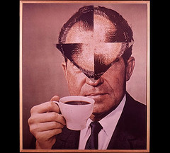
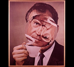
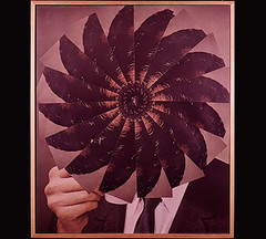
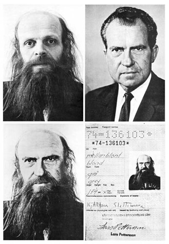
Slettemark (born 1932) has been working a long time, in Norway and Sweden... the Nixon Visions work started in 1971, with a found photograph of Nixon to which Slettemark added a hand holding a coffee cup, appropriated from a Swedish advertisement for a popular coffee. It was unsettling for these two ubiquitous images, with oppositional associations, to be seen combined... and wheatpasted all over Stockholm.

Next, using scissors and glue, Slettemark used the altered photo to create a series of Nixon Cut Ups -

Kjartan Slettemark

Kjartan Slettemark

Kjartan Slettemark

Kjartan Slettemark
ClicK here to see all of the Nixon Cut Ups.

Kjartan Slettemark
Slettemark's final act in the Nixion Visions was to somehow get issued a passport which included a photograph of Nixon, but with Slettemark's hair and beard. The next year, 1975, he used that passport to travel to NYC.

Slettemark has done so much more, both before and since... go to his website to see some of his sculptures, performances, paintings, video, photography. I like this 2004 video of him disrupting an art fair as Marilyn Monroe, followed by masked assistants holding his Warhol-like portrait.

Sunday, March 18, 2007

nice big sculpture


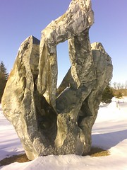
This is in someone's front yard, in Salem, NY... it's big, almost two stories... I don't know who the artist is. There is another big one close by, plus snow piles that may be hiding more buried sculpture.
I like the silver and twisty riveted metal, like Jamgochian's building. This would look great next to that building.
02-24-07_1544.jpg
This is the front side seen from the street, it's like a giant scholar's rock. Maybe I will come back when the snow melts and set up a little table and THINK about things...

Thursday, March 15, 2007

Herman 'Ray' Davis, Maurice Grossman, Tatyana Grossman and Universal Limited Art Editions


Herman 'Ray' Davis is exhibiting at a coffee shop in Saratoga... these are striking... I was drawn to them immediately...

The artist celebrated his one hundredth birthday on Monday, and most of the work in the show is from fifty+ years ago. He started painting in the army, then became a dentist, and at some point befriended an artist named Maurice Grossman. Grossman gave Davis painting lessons... the woman in the two kitchen pictures is Grossman's wife, Tanya, painted in 1952.

Tanya Grossman is maybe better known as Tatyana Grossman... the woman who started the printmaking business which became known as Universal Limited Art Editions. Her impact can't be overstimated... this is the woman who convinced artists like Rivers, Johns, Rauschenberg, Hartigan, Dine, Frankenthaler, Newman to come to her Long Island workshop and try making prints... the whole artform of contemporary printmaking is indebted to her, if not the entire artmarket for legitimizing the concept of editions.

These Davis paintings, both called Tanya's Kitchen, were made a few years before Maurice had the heart attack which prompted Tanya to start her business. Ray later recieved artist proofs in exchange for dental work.


RIGHT NOW at MoMA - Artistic Collaborations: 50 Years at Universal Limited Art Editions. Here is the NYTimes review.


This one is called Mother and Son, from 1948. I would have posted these paintings regardless of the interesting Tatyana Grossman story.

Tuesday, March 13, 2007

(b)ananartista, Hans Heiner Buhr, Esiri Erheriene-Essi, the internet, Saatchi thing, Uber thing, PLUS


Hans Heiner Buhr, bad chicken arrives, 2007

Hans had a nightmare -

"I dreamed last night, that I sold a piece on Pulse. It was a photo-poster of a book reading tramp in b/w, what was a print and very popular in the former German Democratic Republic. I remember I just signed and framed that poster and it got sold in minutes for USD 16.000"


Esiri Erheriene-Essi, Shock of the New Shit/Art Shows Make Me Paranoid, 2006

Esiri is an artist in London... her paintings are full of details and stories, all of which are talked about on her blog.


(b)ananartista!!! Have you watched his youtube videos yet??? Okay, if you click on some of those it warns of "adult content"... but just do it... it's not explicit. Do it for the sake of humanity.

The internet is amazing... I didn't even get e-mail until 2001... how would I have ever heard of these artists before the internet??? One is a German living in Tblisi, one is in London, and one is in Italy; I "met" Hans on blogs, Esiri on flickr, and (b)ananartista through youtube.

I put some stuff on the Saatchi site... I had reservations, because there is just so much stuff on there it is overwhelming, but Hans is on it, Esiri is on it, and I'm already on the Artists Space site; neither site is curated/juried... what difference does it make.

I'm not on re-title, but re-title isn't free... although I can't figure out from the site how much it costs to join. I think I had an early chance to get on re-title for free when they were starting, but I stupidly didn't do it. re-title lists anaba, thanks re-title.

Uber is the newest one... this is LA based, and free... here is MY UBER PAGE. This site was complicated, for me... but I finally got it. You have a lot of control with this one... and it's kind of like myspace. Mark Creegan is on it, Carol Es is on it... we all designed our own pages. Glenn Kaino and Lauri Firstenberg are involved with it somehow.

Inliquid - this Philadelphia site is the first one I had my work on, before the other free on-line ones started up, but I'm off now.

I can't believe it's been so long since I made this first post on artist's websites....

It would be nice if the White Columns registry were re-activated, and was utilized. I think that was the only juried one.... just something small to shoot for. It was a first break for so many.

Deborah Kass, 1999 -

"White Columns is 'ground zero' for emerging artists at the moment," says Kass, referring to the well-known alternative space now located on West 12th Street in Manhattan. "They're always showing interesting work -- that's where we first saw Christina Mazzaluppo, Eric Parker and Karen Heagle. We own works by each of those artists, and they've all been seen in White Columns group shows or solo shows."

Saturday, March 10, 2007

ArtReview blog VS. Artworld Salon

James Westcott's ArtReview blog on Myspace VS. Spiegler, Stewart & Szantsos' Artworld Salon

These are both interesting blogs, and I do like them both.... BUT...

Artworld Salon's Ian Charles Stewart on the ArtReview blog - "my view is that the MySpace product looks amateurish, functions poorly and may be rejected by the MySpace community for invading their space under false pretences."

Artworld Salon's Marc Spiegler on the ArtReview blog - "I’m not a MySpacer, but I’d hazard a guess that at this point they are pretty used to people hijacking their “community” for commercial purposes."

Yikes, it looks like the Artworld Salon guys don't exactly know what they are talking about. Isn't that called.. gossip? Not a good sign for a blog that only allows comments from fellow approved "experts" and claims not to be a place for gossip.

So, what does ArtReview on myspace talk about? Um, pretty much just art. Anybody, or at least anybody who has a myspace account, can comment on the ArtReview myspace blog.

So.. due to an unseemly combination of ignorance, hypocrisy, and pretension... THE WINNER IS ARTREVIEW ON MYSPACE!!!


on notice.

RELATED: on Artworld Salon last week, Ed Winkleman and commenters on Artworld Salon yesterday

Thursday, March 08, 2007

Huang Yong Ping


This is probably my favorite piece from Huang Yong Ping's just-closed Mass Moca show... it's a 1990 piece called Face/Brain.
Aren't they a little like James Castle figures?
Huang Yong Ping
Side of Face/Brain.... if they could talk maybe they would say "Ni hao, can you please tell us how to get to Idaho? We are friends of James Castle".

Wednesday, March 07, 2007

Cai Guo-Qiang's Mass Moca tiger installation VS. Huang Yong Ping's Mass Moca tiger installation


Cai Guo-Qiang... 2005

VS.

Huang Yong Ping
Huang Yong Ping... 2007

Oh man.. I saw Huang Yong Ping's not very engaging retrospective at Mass Moca... the worst (or maybe best) part was entering this room while ACTUALLY saying "this is the room where that last guy had those tired tigers"... and seeing ANOTHER tired tiger installation!

What?! Wow, they are keeping those Chinese tiger fabricators busy over there! Is there a tired tiger installation in the corner of every studio in China? I'm totally confused by the decison to put this new tiger in the exact same room as the last ones, I mean, this is a BIG museum, with both artist's individual exhibitions filling several galleries.

SORRY! We have NO WINNER in this contest... they are both DEAD BORING TIRED.

RELATED: Eric Fischl's Arthur Ashe Statue VS. Paul DiPasquale's Arthur Ashe Statue

Tuesday, March 06, 2007

two small paintings


untitled. this one doesn't even have any paint on it... i will do some more stuff on my old bluejeans.


untitled. it has a little glob on the right i might pick off.

Monday, March 05, 2007

Judith Supine! Woah, Amazing BEFORE and AFTER photos, PLUS... RVA Gallery Results Are IN! and a BONUS REWARD!!!


Somebody left a comment on the old in-between alley post... with a link to somebody's flickr page showing the work when it was NEW. Wow! I had no idea they were so bright, these are acidic... looks great on the bricks.

looks like a rats
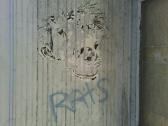
Here is the photo I took when first seeing this piece. The artist is called Judith Supine.... it looks like s/he's moved to NYC and is doing a lot of stuff up there. Here is an EXCELLENT youtube video showing how they make the posters and collages.

Here are a couple more of my AFTER photos, and the BEFOREs:


rats is the word
Yay to RATS! Rats is the word!


doorway #2
Never posted this photo before... and it was taken well after Christmas was over.

PLUS! RVA Gallery Results Are IN!!

Heart as Arena posted on Scope, mentioning ADA Gallery, saying he was excited to see them after reading about them on my blog... so now that I have started adding labels to old posts I can easily go back and see what RVA galleries have been "featured" the most.

ClicK on a gallery link below to see all of the feature posts on that gallery... newest posts will be on top, scroll down for older posts. It only shows twenty posts, so if a gallery has had more than twenty features they won't all show up.

1708 Gallery - 6 times
ADA Gallery - 24 times
Anderson Gallery - 13 times
Chop Suey - 7 times
Gallery 5 - 4 times
Nonesuch - 10 times
Reynolds Gallery - 10 times

BONUS REWARD!!!

Okay, if you have made it this far your Bonus Reward is a link to a new-ish artblog called Artworld Salon. This is Marc Spiegler , Ian Charles Stewart , and András Szántó's new blog...

It's informative, and a little different in that commenting is by invitation only, or something... I guess that is what the "Salon" part implies.

ummm, I'm a little put off (I'M JEALOU$!) by the sense of privilege, and exclusionism - it appears Szanto is hoping to make happen the sort of thing he talks about here - and I'm not getting the sense that their definition of "artworld" includes artists... but, it's still interesting and they aren't really talking about art anyway.

UPDATE 3/5/07: aaack, this Artworld Salon blog is fascinating... it is a good thing... a lot more insight into the money side of it all...

Saturday, March 03, 2007

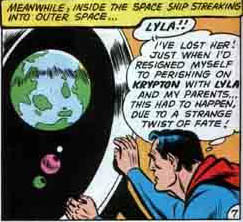
time + space

Fragonard
Fragonard, The Love Letter, 1770

Wayne Boring
Wayne Boring, panel from Superman #141, 1960

(b)ananartista!!!!!!

(b)ananartista
oh man, he is so funny...
i thought i had made an okay painting salesman commercial, but then i uploaded it and saw (b)ananartista's.

he's italian. these are youtube -

1. for the sake of humanity! BUY IT!!! this is the commercial.
2. boobs monster hot cartoon
3. BECOME AN ARTWORK OF (b)ananartista®!!! take part of the greatest artwork of the world.

so good... music, drawings and videos, so funny. they are all short, like one minute.

Friday, March 02, 2007

Landscape Architects, at the Arts Center of the Capital region


Artists Space curator Jennifer Moon has organized a show, Landscape Architects, at the Arts Center of the Capital Region (Troy, NY). I saw this show last week when I saw the Paul Santoleri installation at the same place.

Nicola Lopez has a tangle of roads and pipes clustered on the ceiling, spreading out and down the walls. I'm into the colors of those silvery pipes, with the green and blue water, pictured above. The big mass conglomeration on the ceiling could have been maybe denser, or bigger, or a little less black, or less ribbony... or something. It didn't have the same presence as the stuff on her website. Oh... this one looks like it's dancing.

Maybe I should just go back and look at it again.


This is a detail of one of Charlene Liu's pieces.... all of those little rocks are collaged on.... the larger crystalline white forms are painted. Here is the whole thing.

I liked the cut-out paper rocks, they remind me of Frederick.

02-25-07_1530.jpg
Matthew Hamilton gloppy structure.... umm, i like this one especially, because of Grunewald.

02-25-07_1526.jpg
Matthew Hamilton. These are on layers of mylar. Click on those pictures to see them bigger.

So... I wasn't KRAZY about any of the work in this show, and the space felt too white and too empty, but there were lots of parts of stuff that were rewarding.

ARTISTS & CURATORS: Here is the information if you would like to maybe have a show, or curate a show, at the Arts Center of the Capital Region. The deadline is April 13th.

I was in a show here with some good artists in 2003. Here is the review.