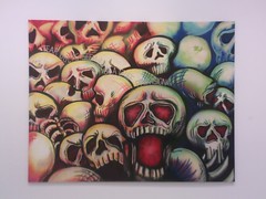
Louis Vuitton is suing an artist, stating "as an artist yourself, we hope that you recognize the need to respect other artists' rights and Louis Vuitton's Intellectual Property rights...".
This from the company that most recently collaborated with Richard Prince. Too funny.
Richard Prince on appropriating Jim Krantz's work for Marlboro - “No one was looking. This was a famous campaign. If you’re going to steal something, you know, you go to the bank.''
Read LV's initial cease-and-desist letter here.
Nadia Plesner's website.
Techdirt.
Eyeteeth.
UPDATE: this fashion blog brought up the Prince/Vuitton thing before i did.
ps - i still want these sunglasses.... they do not like it when you take pictures in their store.
Wednesday, April 30, 2008
Tuesday, April 29, 2008
poster for she-thing
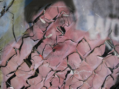
It's clobberin' time!
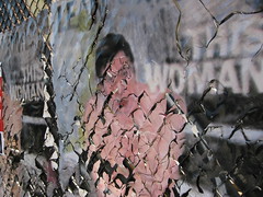
This Woman...

This Man...
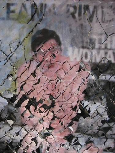
Leann Rimes, This Woman, Monster.
RELATED:
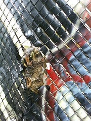
she-thing fence is the SAME fence that was spider-fence. this is the best fence.
links
Saw on Roberta and Libby's that Philadelphia's Edna Andrade has died, at ninety-two. LOVED her. Ed Sozanski on Edna Andrade here.
- speaking of Edna Andrade, I am wondering what Michael Mewborn is doing now. Here's his website.
Tyler has a two-part interview with Art Institute of Chicago curator Lisa Dorin. That's nice to see, cuz she co-curated (with Gina Occhiogrosso) a show I was in a five years ago. We got a good review.
- here is part one of the interview, here is part two.
Sunday, April 27, 2008
Eric Gelber on Kelli Williams
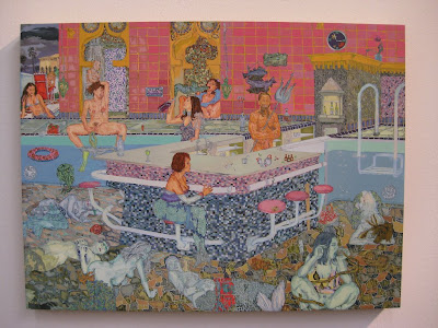
Kelli Williams, Wet Bar, 2007
I posted Kelli Williams' painting, along with work by some other Leo Koenig artists, after seeing it at the Armory Show last month. Eric Gelber contributed so many thoughtful comments on Kelli's painting, too much to leave buried in the comments box... so I'm re-posting them here.
MUST STRESS - this is a series of thoughtful comments on a jpeg, not a formal review. Eric did not see the work in person. Eric's initial response was to an anonymous commenter critical of the accuracy of Kelli's perspective.
There is no consistent perspectival moment if the composition is looked at as a whole. It would destroy the logic of the composition if the artist used one vanishing point to bring coherence to the whole. The artist wants to fragment and compartmentalize space. This increases the isolation of each figure and each action. It is like a tableau. Within each individual segment the local space makes sense, a field that immediately surrounds each figure. A figure sits on the edge of the pool, another one sits on a bar stool, another one is resting her hand on the edge of the bar. This compositional technique emphasizes the isolation of each figure. They are self contained monads, pleasuring and obsessively gorging themselves. It is a symbolic ode to masturbation and self indulgence.The artist is using a panoramic device. The separate little worlds the figures inhabit are interlocked to form an odd montage image.
Each figure in Kelli's painting is going through an internal process. The figures that are gorging themselves are perhaps meant to represent self destructive behavior or the compulsions/impractical rituals that plague individuals. The other figures are lost in their minds or bodies.
They writhe, stare into space. The bartender is the only figure that directly addresses the viewer and the rest of the figures do not acknowledge one another or the viewer. Figures are whole and fragmented. Some of them are asleep, one looks pregnant. They are practicing mysterious rituals.
The variety of poses suggest stages of life. There is a variety of mental states represented in this one painting. (The figures are wonderfully rendered.) They have a corpse like palor though and this again suggests death.
Also the one male figure in the painting is the bartender, the one who serves intoxicants, and he holds a trident like the Greek god Poseidon. Obviously this references pagan culture, but in the setting of a bar/contemporary swimming pool this is humorous, but also a clue as to what the artist wants to tell us about contemporary life.
The bar itself looks pixilated, like it is made from binary code on a computer monitor, and the painting does very interesting things with ideas of flatness and depth. There is no easy way to figure out the pictorial space.
Lingering thoughts about "Wet Bar":
Poseidon, and his underwater realm, is one of the subjects of this painting. The greenish figures are supposed to be underwater. The figure seated at the bar, with her bosom, shoulders, and head and neck above water give this away. Here lower half is submerged and most of her upper torso, which is flesh colored, is above the water line. So the watery depths represent the human unconscious, but interestingly, the figures above the water line are just as transfixed as the figures that are submerged in the water.
The strange entrail/snake like coils that come out of the vaginas of two of the figures are strange, ambiguous symbols. The woman who is suckling or drinking from the end of one of the umbilical cords/green ropes is either slowly becoming colored or her mid-section is evaporating. She comforts/pleasures herself by grasping a handful of her own hair. The idea that a woman's umbilical cord could be used for self nourishment is an interesting idea. The underwater flora and fauna and various sea creatures, rendered carefully and realistically is a very nice touch, as are the air bubbles floating towards the surface.
So there is the clear portrayal of two distinct realms, above and below water. The figures are lost in strange reveries. Poseidon addresses and identifies with the viewer (while sporting a small boner). But instead of ruling over the female figures he is serving them. Human ritual, human ecstasy, orgiastic pagan ceremonies, feminist recontextualization of female nudity and sexuality, human transformation. The female figures below the water have transformed into mermaids or are in the middle of doing so. After they become mermaids they fall into a coma like sleep. So the transformation from human to mythical half human/half animal creature is also a subject of this painting. What are the psychological implications of this transformation? The painting style and formal devices employed by the artist fully enhance the idea content of the painting.
I like the way the painting morphs and blends the textures of digital imagery and classic mosaics. It straddles the two really, which emphasizes your recontextualization of pagan and mythological imagery. One should also note the play on words in the title. A wet bar is a place in the home where you can mix drinks, and it usually contains a sink with running water. We all obviously know about vaginas and wetness. The painting is all about mixing realms, the real and the mythic, flatness and depth. It has great mystery and that is hard to find in contemporary work.
See all of Eric Gelber's reviews for Artcritical here.
Friday, April 25, 2008
Tuesday, April 22, 2008
Yale is the new RPI?
Yale dean Robert Storr wants to ban that undergraduate student from showing her work unless she will sign a "confession" stating it's all fiction.
Wow, she's pretty awesome to have made enemies with Robert Storr while still an undergrad. That's ridiculous that he would insist she sign some paper, or would ban the work. Yale is the new RPI?
Storr said in a written statement, "If I had known about this, I would not have permitted it to go forward...This is not an acceptable project in a community where the consequences go beyond the individual who initiates the project and may even endanger that individual."
- What does that mean? That an artist shouldn't make work that might have any consequences within a larger community? That an artist shouldn't risk offending anybody's sensibilities? I wonder what position Storr takes on the RPI/Bilal incident.
This is also making me think of Storr's affadavit for Christoph Buchel, in which he stated “In my view, under no circumstance should a work of art be shown to the public until the artist has determined that it is finished", written while presiding over the Venice Biennale showing a brand new Felix Gonzalez-Torres piece made (and sold) fifteen years after his death.
ps - i'm not mentioning the artist by name, or getting into the details of her project, because it's much less interesting to me than Yale/Storr's attempts to ban it, and the forced signing of confessions.
Jeffery Beardsall

Jeffery Beardsall
Found two Jeffery Beardsall pieces in a new junk shop... they are NICE. Folded paper, with some kind of paint and/or pastel, in plexiglass cases, signed and dated 1979. Click on any of these pictures to see them much closer, it's worth it.

This is how I found them, but not exactly, because when I found them they were upside-down... plus, the guy has taped that white index card with the artist's name to it. I should have kept my mouth shut, maybe.

The plexi cases are original, but cracked and broken in spots. I really like these. Keep thinking of Jo Baer.
Labels:
abstract painting,
artists,
found,
Greenwich,
Male,
painting,
plexiglass,
sculpture
Sunday, April 20, 2008
Friday, April 18, 2008
jamie o'shea is super lame
.
supertouch (jamie o'shea) used eight of my photos, taken from both anaba and my flickr set, without any link or mention.
LAME.
thank god there is so little overlap between the stuff i want to talk about and the crap on supertouch.
i left a comment but it's "awaiting moderation"... lamer.
UPDATE: my comment was moderated into the void... new comment awaiting moderation is -
"hey, jamie o'tightie pants, why so lame?"
UPDATE #2: holy smokes he did it again... (scroll down)
UPDATE #3: again... with a pro photog, tod seelie... he's pissed.
RH Quaytman at Orchard, with Rhea Anastas and Amy Sillman

In the window at Orchard, RH Quaytman's photo (silkscreen?) on wood panel... a picture of a storefront flower shop window, in the storefront window of the gallery, a former flower shop.

RH Quaytman paintings - silkscreens and painted silkscreens on beveled wood panels, with slots in the back for hanging. You're welcome to pull out the paintings for study, and to hang them on the wall.
Most of them are tight oppy patterns and grids, with some silkscreened b/w photos, some text pieces, some combos.
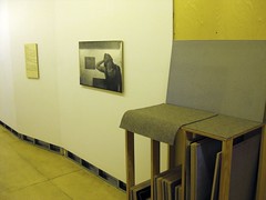
That wall was bare. I selected and hung those two pieces.

Amy Sillman's portraits of people associated with Orchard.
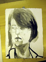
Portrait of RH Quaytman, by Amy Sillman.

The storefront window piece is propped up by a view from the back of the gallery, at the center of which is the window the piece is sitting in. The faded lattice (from the flower shop days?) echoes the patterns and stars-of-david of the op paintings, which in turn reference the space's previous use as a minyan.
It's interesting that the flower-shop photo in the window is like a false front, a block, and the reverse side is an extension of the gallery space. Sorry, I can't explain well, but I like that spatial wormhole thing I am thinking. I guess it's like a mirror.

Activity at Orchard.
- The large piece partly visible on the left, by Quaytman, is an Orchard spreadsheet, listing all the gallery's financial data, including records of all sales and how the monies get divided/used. One of the members fronted the rent money for the entire three-year lease of the space, as a loan to the gallery, a percentage of which gets paid off each month from sales of work. Orchard members pay dues to offset costs. I don't know the terms, but the spreadsheet is layed out in a way that references Hebrew/Judaica, with some info on the right instead of the left, and partially utilizes a Hebrew font.
- The piece left of center is a silkscreened photo of the hall directly to it's right, overlayed by a dense star-of-david pattern; at the end of the hall you can see people studying Quaytman's rack of paintings.
- Amy Sillman is talking to someone, at right; the center table holds her portraits of Orchard members and associated curators, critics, artists. I don't think any of them were painted on-site, she said that the people have come to her place or she has gone to them.
- The case on the right contains a chronological row of Orchard reviews, from which Rhea Anastas has pulled excerpts in an effort to tell the story of how Orchard has been perceived. I didn't get the narrative arc that I think she sees, but this is an intensely hermetic show and it's like you sort of need to be a member to really get the perceived increasing lack of interest.
(maybe more later. really liked this show)
Labels:
Amy Sillman,
artists,
context,
Female,
harmony of art and space,
installation,
LES,
painting,
RH Quaytman
Thursday, April 17, 2008
Wednesday, April 16, 2008
Mike Erickson

Mike Erickson - (i don't know if he has a website...)
UPDATE: Mike Erickson has a blog on which he posts famous albums, every song first to last, but all covers found on youtube by different, random people.
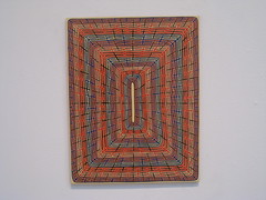
at James Siena
Sunday, April 13, 2008
Lady Pink
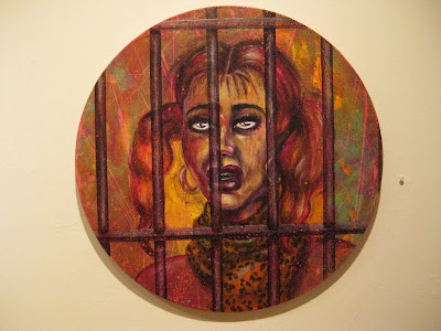
Lady Pink, at Ad Hoc Art.... right next door to the good coffee shop I am forgetting the name of.... also within easy walking distance of Pocket Utopia.
I can't believe she isn't that much older than me.... she's been around so long. This work is all new, some (most?) dated 2008. You can get one of these for less than half the price of a Judith Supine... I don't get the art market pricing system (I'm saying that as a fan of Judith Supine).
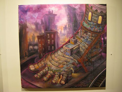
Five Points. Here's a bigger better view.

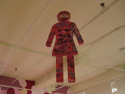
PLUS: Really liked the 1983 collaborative piece (with Jenny Holzer) she had in I Am As You Will Be, at Cheim & Reid last fall -
More Jenny Holzer + Lady Pink images here.... and here's a good image of one. Ilona Granet did the lettering for Jenny. I'm not sure how it works credit-wise, who the "artist" is... the Cheim & Read show label said the piece was by Jenny Holzer and Lady Pink, the Monika Spruth Philomene Magers listing says they are by Holzer, with credit to Granet for the lettering and no credit to Pink. Lady Pink's paintings are AWESOME... - from anaba 2/26/2008
Saturday, April 12, 2008
Friday, April 11, 2008
Tyler Green and Christian Viveros-Faune respond to James Kalm
Tyler Green and Christian Viveros-Faune respond to James Kalm's March Brooklyn Rail article.
1. James Kalm's March Brooklyn Rail article, The Ethics of Aesthetics.
2. Tyler Green's letter to the editor and Christian Viveros-Faune's e-mail.
1. James Kalm's March Brooklyn Rail article, The Ethics of Aesthetics.
2. Tyler Green's letter to the editor and Christian Viveros-Faune's e-mail.
Thursday, April 10, 2008
Barnaby Whitfield, Artist and Curator

Barnaby Whitfield, Fit To Burst! (Heather Stephens As The Bird Flu), 2007, pastel on paper, 28.5 by 36"
Barnaby Whitfield, Little Deaths, All The Same, at 31Grand. Heather Stephens, pictured above, is one of the owners of the gallery. Click on the picture above to see it better.
I like these two photos because you can get an idea of the installation and scale.... all of his stuff is pastel on paper.

Barnaby Whitfield, I Found Love On Manhunt! (His Profile Name Was Hernan Bas), 2008, pastel on paper, 22 by 30.
PLUS: Barnaby organized a show for the back room -
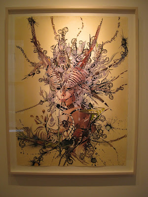
Debra Hampton, Dancer of the Kept Bolts, 2008 - my favorite in the back-room show put together by Barnaby.

!!! Gorgeous. Click the picture to see it BIGGER. Magazine collage and watercolor drawing...
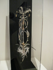
Debra Hampton, Talisman (QRO), 2008, Crystal, glass, wood, silver-plated, ceramic and bone beads, feathers, deer teeth, sewing needles, x-acto blades, morse code

Christian Sampson, Oscillate Wildly, 2007, acrylic and cord on panel and Jennifer Coates, physical fraction, acrylic on canvas.
CLOSES APRIL 19th!
Labels:
artists,
Barnaby Whitfield,
group shows,
painting,
pastel,
sculpture
Wednesday, April 09, 2008
Megan Pflug

Megan Pflug, Night Gallery, at V&A.
This show was kind of perfect... perfect for the space, perfectly scaled... each piece excellent, all of them together perfect, from every angle.
(okay, i really liked this show... i want to go outside now, but hopefully i can come back later and add something "smarter")

Think Twice, mixed media, 2008

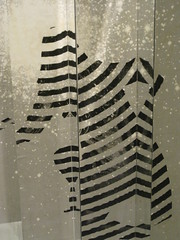

Untitled, mixed media, 2008 - this is the same piece that is on the floor in the top picture.

We Walked, And Walked And Walked, mixed media, 2008

detail of the couple... they disappear into another dimension.

Silver Machine, carbon transfer on paper, 2008
Labels:
artists,
Female,
harmony of art and space,
installation,
painting,
sculpture
Monday, April 07, 2008
Larry Zox

Double Gemini: Catumb Passage, 1969, acrylic on canvas

Diagnol II, 1965, acrylic on canvas
SHAZAM!
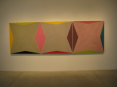
Untitled - Triple Gemini, 1969, acrylic, epoxy on canvas
Larry Zox, at Stephen Haller Gallery.
Larry Zox is one of the artists represented in the amazing all-hours unmonitored underground art and architectural installation that is the Empire State Plaza.

at Stephen Haller Gallery.

Hayward Series IV, 2000, acrylic on canvas
This show closed April 5th.
RELATED: all my Empire State Plaza posts so far - James Wines, Donald Judd, Empire State Underground Christmas!, Wallace Harrison and Nelson Rockefeller's Empire State Plaza.
Labels:
abstract painting,
artists,
chelsea,
Male,
painting,
Stephen Haller Gallery
Peter Coffin
Labels:
Andrew Kreps Gallery,
artists,
chelsea,
installation,
Male,
Peter Coffin,
sculpture
Subscribe to:
Comments (Atom)


