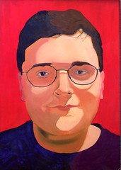
...

.
Showing posts with label Anderson Gallery. Show all posts

Friday, September 29, 2006

Artificial Light


Artificial Light, curated by John Ravenal, is at VCU's Anderson Gallery through October 29th. I'm glad I went to the opening, with all the people, and also later on when it was mostly empty. Most of the work in the show is better experienced without a crowd.

This show is so dark... I didn't know John Ravenal had such a dark side. I think I was expecting more of a mellow new-agey experience, like a Turrell or that big sun, but this show is political.

Jennifer Allora and Guillermo Calzadilla are showing a frankenplant being given just enough stimulus to keep it alive, the blue light emitted from a non-stop upward flow of Jenny Holzer's truisms - "symbols are more meaningful than things themselves", "the idea of revolution is an adolescent fantasy". This plant will now do anything that Jenny Holzer commands.


Iván Navarro has two black-light neon chairs, side by side in a pitch black chamber. Totalitarian design, awe and dread.


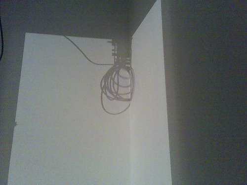
This is the shadow of an electrical cord cast by Nathaniel Rackowe's Dead Reckoning. He's built a corridor along which a bare electric bulb slowly tracks back and forth; as the bulb travels loops of slack cord are pulled up and the shadow noose tightens.


The corridor.


There are slats in the corridor, not wide enough to pass through, but you can walk all around the whole thing as shafts of light sweep through the space... LOOKING FOR YOU.

fartist sighting
Spencer Finch's Kaaterskill Falls is the one piece that was better experienced with a crowd of tourists and tiny honeymooners. I like this piece (especially with people), but whereas before I was thinking this was the odd piece out, now I am thinking of it as the perfect complement to the rest of the work in the show. Interrogation, torture, and execution... with an American classic. Kaaterskill Falls is in the first room, so it is both your first and last impression of the show.

maybe more later... ?

Saturday, September 16, 2006

fartist sighting


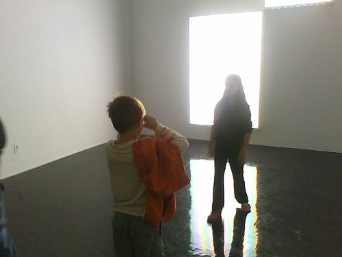
I saw the fartist last night at the opening of John Ravenal's Artificial Light. The fartist is smooth; last time I saw him he was with some girls under Rachel Hayes' installation, now here he is taking an imaginary photo of a girl in front of Spencer Finch's Kaaterskill Falls (the colors don't show up in my photo, sorry). This seem so perfect, two children taking pretend honeymoon-like photos in front of artificial falls.

RELATED: Here is an interview with John on the show.

Bonus!: John Ravenal in Rachel Hayes' piece.

Thursday, July 13, 2006

summer at Anderson Gallery

There are two shows up at the Anderson Gallery this summer, or at least until the end of the month. The first floor show features work from a corporate collection, and the second floor show has stuff from the Anderson Gallery's collection that was selected by a museum studies class. Some of the artists featured in the two shows include Julia Jacquette, Elizabeth Peyton, Tom Sachs, Andy Warhol.... I'm forgetting.


T.L. Solien - It was a nice surprise to see this one. I saw his work in two concurrent solo shows in Philadelphia some time ago (at the Print Center and the Esther Klein Art Gallery - neither of which is listed on his resume for some reason) and then completely forgot about him again. He lives in Wisconsin.


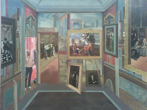
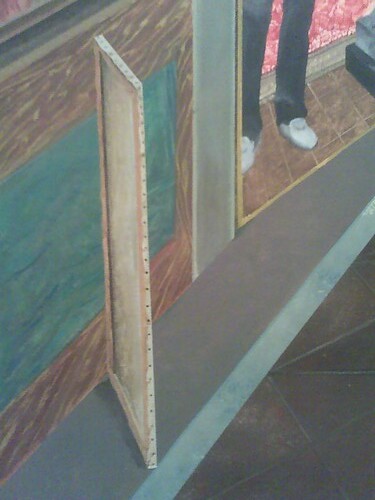
Bill Haney - This big painting has a good spot on the second floor. That is Sidney Lewis standing in the doorway/painting. This painting is weird, full of strange overlaps and perspective. Look at the top and bottom of the door Sidney is standing in, or is that a painting of Sidney? Can't tell.

I have never heard of this artist and couldn't find anything about him on-line. The painting is The Right To, from 1973.

07-12-06_1324.jpg
Floating private painting.

Tuesday, January 10, 2006

Maix Mayer

from Grizzly Man movie
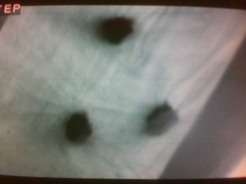
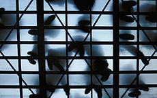
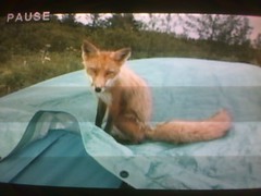
This scene from Werner Herzog's Grizzly Man made me think of one of Maix Mayer's Surface Charge movies, the one shot from below a frosted glass floor. The still below doesn't picture it, but my favorite part of this quiet video of a crowd entering a small room and milling about before exiting is the entrance of a presumably older person with a cane. The little dot of the cane touching the floor, disappearing, then touching the floor again was very nice.

Maix Mayer
still from Maix Mayer's video, Oberflache

from Grizzly Man movie
This fox is what was pawing at the tent (in the first still above). This scene had a sense of magic, mystery, wonder, tenderness, and possible danger. The tent was being poked and the film-maker, Timothy Treadwell, is in the tent poking back at the paws with his finger. Have you seen this movie?

Sunday, January 08, 2006

Super Surface Charge!!!

Super Surface Charge
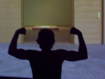
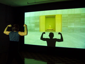
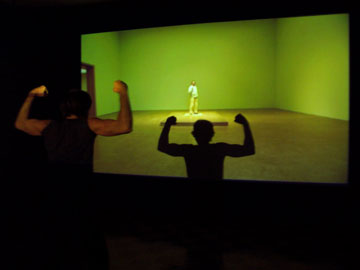
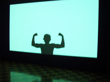
Maix Mayer's movie was good, but didn't have enough Surface Charge. Also, that show had eleven artists - only three of whom were men! Jeez Louise, what's up with that?? So I added some surface charge and much needed testosterone.

Super Surface Charge

Super Surface Charge

Super Surface Charge
I won! I beat the Maix Mayer movie!!

The End

Thursday, December 29, 2005

Surface Charge - Elana Herzog, Maix Mayer, Karina Peisajovich, Kim Schoenstadt, Katrin Sigurdardottir, Sally Smart

Tyler's post last week mentioning Katrin Sigurdardottir and the Anderson Gallery's Surface Charge show is the prompt needed to finally finish posting my own thoughts on the show. The previous post, talking about the work of Lisa Sigal, Odili Donald Odita, Karin Sander, and Ragna Robertsdottir, was way back on November 6th.

Elana Herzog - Formally interesting. Old bedspread stretched across a corner, a million silver staples. Nice scrambled-egg color and texture to the coming undone bedspread. The whole thing was on an angled wall that was built on-site, itself sort of stretched across the gallery's actual walls.

Too bad she had to be so close to Katrin Sigudardottir's large floor sculpture. Most of the artists in the show had their own rooms or bigger spaces; the very close proximity of these two works compromised both. Sigurdardottir had two small floor models each in their own very small rooms, it would have been a better presentation for both artists if Sigurdardottir's large piece had been given one of the small rooms, and that room's small model were in this room with the Herzog.

Maix Mayer - He had two videos. It's hard sometimes to just think about the work itself, to consider it on it's own merits, when it is included in thematic exhibitions making elaborate claims. Surface Charge, according to co-curator Gregory Volk (along with Sabine Russ), is supposedly all about turning the "very surfaces into active forces as opposed to neutral supports", with the brochure stating that much of the work was made on-site, specifically for this exhibition, and "will exist only for the duration of the exhibition". I think he used the word "miraculous" in an interview with the Richmond Times-Dispatch. It was frustrating to try and appreciate a video (made in 2003) within this context.

It also took me a little while to realize that the sound I was hearing from one video was actually coming from the artist's other video next door, and vice versa. I had to walk back and forth a few times between the two rooms - separated by a makeshift wall - before I got that the music of the large video wasn't intended to be heard with the smaller video and it's softly murmuring crowd.

....more on the Maix Mayer...

Karina Peisajovich - This was a very popular room at the opening reception, and looks great in the photo on VCU's website, but the initial enchantment lessened with each subsequent visit. Maybe a nice place to have a drink or something, take a nap, have a rack of groovy clothes to sell, make out.
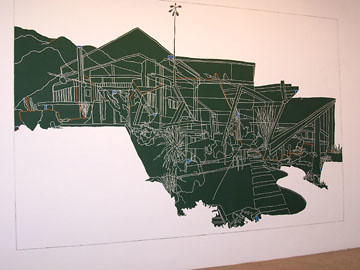
Kim Schoenstadt
Kim Schoenstadt - She had a big center wall painted chalkboard green, with a white-lined drawing carved into it, flanked by two smaller wall drawings in pencil. The three drawings were all architectural, and interesting in that the big green one up close almost read like a map, with maybe roads and rivers, and from farther back it was like a specific place - maybe a house in Caliornia. You can see this nice place to be, but the closer you walk up to it the more abstract and farther away it becomes.
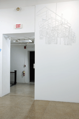
Kim Schoenstadt
The much smaller pencil drawing on the left, way up near the ceiling, was like a house up close but like a chandelier from farther away; or maybe the diagram of the shadow of a chandelier.

The more I think about this work the more I appreciate all the shifts of scale and space and place, including my own place in the room and wondering where that room exists.
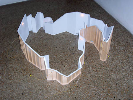
Katrin Sigurdardottir
Katrin Sigurdardottir - She showed three floor sculptures, two from 2003 and one dated 2004. My take on these three imported sculptures is similar to (but stronger than) the frustration with the Maix Mayer videos; these pieces not only didn't surface charge anything, they had no relationship to the space whatsoever.

What is the deal? Are the curators to blame for hyping up a show's themes and selecting work that doesn't fit, or did the artist not live up to the curator's expectations?
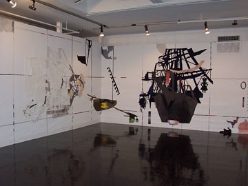
Sally Smart
Sally Smart - This piece, The Exquisite Pirate, was so much better on the second visit, without all the people of the opening reception obscuring the view of the floor. Did she know how shiny and reflective the floor would be? Very nice.

The cut-out pirates (and fairy tale-ness, and travel themes) reminded me of the paper cut-outs of Hans Christian Andersen.
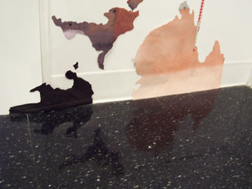
Sally Smart
Sally Smart rorschachs.

not surface charge
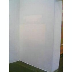
This was one of my favorite Surface Charge moments, arriving one day to find that a bookshelf had been moved so they could paint the wall, leaving a ghostly mirage. This was right around the corner from the Karin Sander, the difference between them being that this was an unexpected delight.

The only artist left to discuss is Laurence Weiner, but I can't because I have no idea what I think - which is an excellent thing. To be confounded is the best.

Sunday, November 06, 2005

Surface Charge - Lisa Sigal, Odili Donald Odita, Karin Sander, Ragna Robertsdottir


Lisa Sigal, originally uploaded by Bromirski.

The stated ambition of Surface Charge, co-curated by Sabine Russ and Gregory Volk, and on view at the Anderson Gallery through December 4th, is to turn the "very surfaces into active forces as opposed to neutral supports". The exhibition brochure shares that much of the work was made on-site, specifically for this exhibition, and "will exist only for the duration of the exhibition".

The best works in the show are the ones that come closest to meeting these ambitions. The less fulfilling pieces - the Karin Sander, the Ragna Robertsdottir, the Maix Mayer, the Katrin Sigurdardottir, and, to an extent, the Lawrence Weiner - are the imported ones that have been shown before and will be shown again elsewhere. Pieces like the Sander and Robertsdottir may not exist, per se, when not being exhibited - but these trademark wall-pieces are most certainly imported works.

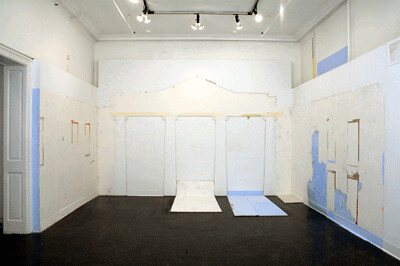
Lisa Sigal - Lisa Sigal's piece, pictured above, is called White House, and is one of the few pieces in the show that fully meets the curator's stated aims of transforming or charging the walls so that the space itself become the work of art. It is a beautiful and understated piece, very cool to stand there within the chalky crumbling classical ruin of a stage-set White House. The piece is full of subtle blue and yellow charm points extending all the way to the ceiling. The short statement about her work below is perfectly accurate -

"My paintings on canvas, walls, and recycled sheet rock explore artifice and the possibility of physical entry to the picture plane and offer a momentary bridge between the unequal worlds of the imaginary and the real."

Odili Donald Odita - He has designed two murals, one on either side of the room. They're nice, one consists of warm earthy colors and zig-zaggy patterns and looks good with the arched doorway at it's center. The other is two wall-wide bands of bars of powdery black paint on a white wall, all oppy if you get close.

The room definitely has an African feel, something that I would get without knowledge of the artist's name, and being in this room does somehow feel like being in an another place; like there might be palm trees outside. I think this might be the piece in the show that, with the centrality and associations of the arched doorway, makes best use of the building's existing architecture.

I'm pretty sure Odita also did Nonesuch. Ha ha! Just kidding.

Karin Sander - Sander is represented by a small example of one of her trademark wall-polishings, which was a letdown. If the idea of some of these pieces is their ephemerality, that the work will exist only here and never be seen again, isn't that defeated by the artist's willingness to schlep the same schtick whenever and wherever she's called to do so?

Excerpts from an interview with Karin Sander -

"My work is perhaps best characterised by the fact that when I start out, when I first confront an exhibition situation or a problem, I have no idea what kind of work will emerge at the end."

Sorry Karin, this wall-polishing is EXACTLY what I was expecting, if not less so.

"in each case the next step is not defined for me in advance, so that the works that emerge are always very different from each other. They may have a lot to do with the works that have gone before, but it’s quite different from, for example, going into a studio where I know I will find paints and a canvas – in other words where I will at least know where to start."

Painter says Please. Shut up.

I found the placement, on a very narrow wall between the entrance and the reception desk, to be distracting. The big thrill of a Sander wall-polishing is just staring at it and getting that disorienting op effect of it disappearing or the wall disappearing, or the piece becoming one with the wall - but it wasn't so easy to focus on it here. Too much peripheral vision stuff.

Did she actually come or was it done by someone else?

Ragna Robertsdottir - It's LAVA, get it? It is charged! She is from Iceland. It is a volcano. It is LAVA, do you hear me? Get it?? It is glued to the wall!

Actually, this was more interesting to look at than the Sander because it is so big. It's fun-ish to get close and look at it from an angle, it can look like throbbing magnetic fillings or hair, and to step back and try to see patterns and swirls. You start to see them, and wonder if they were intentional or not. Good place to sway back and forth and practice your transcendental meditation.

Opposite the wall of lava(!), called Lava Landscape, she glued a much smaller square of crushed glass, called Glacier. This has confused me because the one piece, Lava Landscape, is actually made from the stuff it represents and the other, Glacier, is not. What does that mean? Anything? I'm afraid not.

It bores me even more to know that this, like the Sander polishings, is something that just keeps getting reproduced in different places. I resent the ooh-aah promotion as one-time-only! site-specific! transformative! non-products when they are, in fact, no different from any other painting or sculpture that can be delivered and sold.

more later -

Friday, November 04, 2005

Surface Charge


nsc, originally uploaded by Bromirski.

Yikes! Only one month left to see the Surface Charge show and I haven't said anything about it yet! I've visited three times but still need to go back and just spend some quality time there. The Lisa Sigal piece is still my favorite, and I'm enjoying some of the others more and more with each visit. Sally Smart especially. They have an excellent website and if you go to this page and click on any of the names on the floorplan you can see that artist's contribution.

If you go today or tomorrow, please take note: the photo of the piece above is NOT part of the show. It was so funny to turn the corner today from the Karin Sander piece and see that they had removed a bookshelf, leaving this strange ghostly shape. It really looks like it could be a piece in the show. So funny.

Sorry my photo is bad, I ran outside and convinced a total stranger to come back in and take a photo with her cell-phone camera. Thanks, Ophelia!

Thursday, June 30, 2005

Relativity


Relativity, originally uploaded by Bromirski.

Someone was kind enough to send me some photos of Relativity, the Anderson Gallery's current exhibition, featuring the work of four local artists (Jeannine Harkleroad, Chris Norris, Sun Tek Chung, James Davis) each paired with that of artists from the gallery's collection.

The galleries look good, as good as I've seen yet, but some aspects of the installation really bother me. The artwork of the four locals (all of whom work for VCU) is well-presented but that of artist's from the gallery's collection is mostly annoying and frustrating.

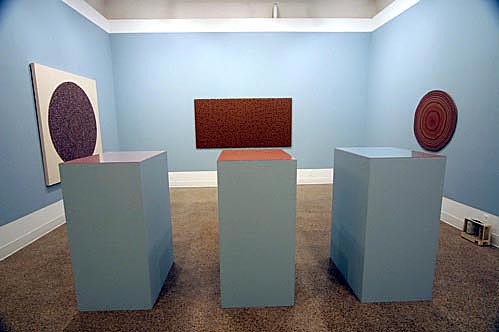
The picture above is of the work of James Davis paired with that of Jules Olitski. The three pieces on the wall belong to Davis; Olitski's prints are on the pedestals. Those pedestals are at least five feet high and covered with plexiglass. I'm six feet tall and except for the edges all I could see was glare. ANNOYING! I'm pretty sure that is not the way the artist intended for them to be presented. Here is what they supposedly look like, but although I've seen them for real I can't confirm that. Hey George, sometimes it is better to see things on the web!

There was a funny(?) moment at the opening when I was on the periphery of a circle admiring Davis' work (including the artist and Dean Richard Toscan) and Elizabeth King was introducing Davis and his work to a couple. She made a sweeping gesture with her arm saying something like "James did all these" which ended with her hand on the Olitski pedestals. I said those were by Jules Olitski and she looked a bit confused. I forget what we said next exactly but I did tell Toscan that I know Olitski's daughter. I was on his left and he continued to look straight ahead and sort of ignore me. Toscan looks like David Paymer to me, whenever I see him I think it's the mob guy from ABC's Line of Fire (it was set in Richmond!).

Almost as bad as the presentation of the Olitskis was the presentation of a photograph by Thomas Daniel, the artist whose work is juxtaposed with that of Sun Tek Chung. I say almost as bad because if you get on your knees and tilt your head to the side you are able to check out Daniel's photograph, whereas with the Olitskis you don't have a chance. Here it is.

At the recommendation of a more sensible artist friend I contacted the curator, Amy Hauft, for more insight into some of her presentation decisions and she wrote back explaining some of her ideas:

"In all cases with the works from the Anderson collection, I wanted to take them away from being exclusively images and force them into being "things". I did this with the Olitskis by presenting them on edge at eye level atop pedestals of their exact dimension. As mentioned in the handout, I wanted to highlight the iridescent ink that was more visually pronounced at that angle. In some ways, you could say that I was treating them the way that James Davis treats his materials. He maximizes what they are materially and then uses that materiality to create his imagery. As for the Daniel photo on the floor... certainly taking the image off the wall and leaning it against the wall turns it into more of an object. I am a sculptor and I always find power in object-ness. Because a thing is in the room with us, it is less ignorable, more undeniable. Part of it was a sense of numbers - that there were/are so many of them (the daughters)...they are waiting in the wings. Part of it is to indicate that its a working project, metaphorically rearrangeable to create other relationships."

I'm glad she wrote back and I get what she was trying to do, but I think the project fails. First of all, they were never "exclusively" images and have always been things; they don't need to be forced. The Olitski pieces now are not only no longer images but irrelevant. The "things" that James Davis' work is relating to are three five-foot-high reflective pedestals.

I'm also extremely disconcerted at the amount of curatorial liscence taken with the work. Why does the art serve the curator and not the curator serve the art? Amy Hauft is an artist herself and the creator of a fantastic installation at the Beaver College Art Gallery a few years ago but suppose a future curator were to reinstall her piece at ankle-level in a pitch-black room, or on a wall, and present it as a Hauft? What is a curator's responsibility to an artist's intention?

I'll post more about the individual artists later, I had to post about the presentation first.

RELATED: Hans Dieter Huber Artists as Curators - Curators as Artists?

Saturday, June 18, 2005

Relativity

Went to the opening of Relativity - the new show at the Anderson Gallery - on Friday and will be going back ASAP. The show features the work of four local artists (Jeannine Harkleroad, Chris Norris, SunTek Chung, James Davis) each paired with that of artists from the gallery's collection. There are some things to love and some things to hate.

One of the things to love is the bright orange room of over-the-top Chris Norris drawing/paintings. Something to really hate is the presentation of the works from the collection. I thought the curatorial connections might bother me but I wasn't prepared for how badly some of the the older work would be displayed.

I'll go into more detail in a future post.

UPDATE 6/20/2005: At the recommendation of an artist friend I contacted the curator, Amy Hauft, for more insight into some of the presentation decisions. I'll share her ideas in the next Relativity post.

RELATED: Chris Norris is also one of the members of Feast, currently showing at 1708 Gallery. I've added a little to my original post on this show. Go see it before it closes on June 25th. Feast is very good.

P.S. - Hello Richmonders! More of you are reading this since that Style Weekly article came out and I'd like to encourage you to leave comments on local shows and art things. Comments can be left anonymously, you don't need to feel shy. This blog is read by people across the country (mostly in NY, VA, and CA) and is an opportunity to give some local names more national exposure. I'm sorry it has been so much about myself lately but I've been a little busy. You are welcome and encouraged to leave comments on a show/artist not covered in the post.

Tuesday, May 10, 2005

VCU MFA Thesis Shows - Round Two


Matt Gamble
Originally uploaded by Bromirski.

The second round of VCU MFA thesis shows is up until May 15 - once again, lots of good work to see. I can't believe I'm saying this, and if you are aware of my initial strongly negative reaction to his work you may not either, but Matt Gamble has won me over. More on Matt below, following are some of the other highlights -

Gabriel Bennet - Gabe is showing a light, bright, airy, shiny, sculpture that fills the room floor to ceiling. You walk in and see a silver sheet mountain landscape with the highest peak in the far corner and the whole undulating thing falling toward you, complete with a waterfall and giant poppies. The landscape ends at about chest level so you never look down on it. You can walk under or around it to the back and see that the whole thing is some kind of crazily complicated umbrella-like contraption, I don't know if it can actually fold/unfold or not, hooked up to a heavy looking body harness. From this side you might wonder who wears this and for what purpose, the evil Penguin or James Bond, but my final impression is that of a Wizard.

Kate Hudnall - More fantastic! She is using the same little room that Ryan Mulligan made such good use of last time and like him creating another world to step into. Kate is a woodworker and the room has been completely remade into an odd little woodworkers odd little woodshop. She's laid a creaky floor, shuttered the window, fashioned an eccentric woodworker's bench, and filled the room with quirky creations, drawings, and tools. Think Keebler Elves. Think Tom Otterness people. Think Gepetto.

I love that both she and Ryan didn't just use the room to present the work but made the room a part of the work. I wasn't a viewer, I was a visitor.

Tim Devoe - I like Tim's work a lot but can't think of anything to say. He was taking pictures when I visited so I didn't study it too long.

Mike Martin - Mike is showing concurently at ADA (with Chris Norris and Buxton Midyette), I'll talk about his work later.

Matt Gamble - As stated above, it's taken me a while to come around to appreciating Matt's work, and in that time I also think he's gotten a lot better. I used to think Matt's paintings were just plain awful but I now find his work clumsy, awkward, weird, genuine, authentic, endearing, mysterious, likeable, and heartfelt. They look like they might have been painted by Fairfield Porter's sweet retarded brother.

Matt includes in his Anderson Gallery exhibition two paintings entitled Mark, both portraits which look so much like the artist they could only be a brother. Problem is, the two Marks have markedly different hairlines (also one has brown hair and the other black). Same face, same smile, same eyes, same age, and same name - but they can't be the same person. Or are they? I have no idea. I go from thinking these are self-portraits, to portraits of a brother, to just wonderment. I like that feeling.

Matt has set me to thinking a lot about artistic intention. I don't know anymore for sure, but I don't think Joan's hair is supposed to look like a yellow mop on her head. Or maybe it is. Does it matter? The painting is beautiful and full of love. I don't think this guy's upper arms are supposed to be that huge, I don't think the cereal bowl is supposed to be that tiny, or the house is supposed to look like it's falling over. Are the weird things I've come to like about this work things he'd correct out if he could?

I started to come around to liking Matt's paintings before I found out that he is one of the students who received a VMFA Professional grant, and now that he is better educated (an MFA) as well I guess I'll just have to continue playing catch-up and trying to get it. Congratulations Matt.

UPDATE: I just noticed this - Fairfield Porter here Matt Gamble here.

Do you have a favorite from this round or the previous? Or a least favorite? With students competing for and winning at the professional level (VMFA fellowships, another student who was recently awarded a $20,000 Joan Mitchell grant, residencies) I don't think there is any obligation to hold to the old "they're students, room to fail, don't criticize" standard - leave a comment. My posts on the first round are here and here.

Monday, May 02, 2005

VCU MFA Thesis Shows - Round One II

Okay, I went back (first visit here) to VCU's first round thesis shows and was able to spend more time with stuff so here are some more introductions -

Marius Valdes - I saw a film he made earlier this year at a Flat International show about this little cute thing, some kind of unwanted mutant, that gets out of it's jar and encounters the scary world. Here in the gallery he had hundreds of these little unwantables, each unique and super cute. They're about the size a finger at most. Super cute!! I took two. I'm not sure if I was supposed to.

Michael Lease - I can't believe he did this. Michael submitted his own In Memoriam piece to the Washington Post and they printed it. His picture is right there along with a short memorial. I heard that he didn't tell anyone and upset a number of people. Wow. It's so weird to look at a real page of death notices and (a) see someone you know and (b) know that he is not dead. I like this piece because it upsets me - I'm upset that he has gone somewhere he doesn't belong and has defiled the page.

Michael also has a big photo/text installation of people that he used to be very close to but are now no longer in his life. Pictures of ex-girlfriends and childhood friends along with short remembrances.

You can see Michael's piece in the April 10, 2005 Washington Post.

Ryan Mulligan - Ryan has a small room installation called Defense is the Best Defense. There is a drawing on the wall of the Anderson Gallery building and a bunch of ways to defend it or escape, a video of Ryan in a corner of his studio swinging shovels and crowbars at unseen (zombie visiting artist?) assailants, and another video of people reading lines from movies like Independence Day. The room is full of tools and planks of wood, probably to barricade the door and window with, but it looks like he either got away or the zombies ate him.

This room is an act of desperation and it works.

The second round of thesis shows opens Friday, May 6th.


Wednesday, April 27, 2005

VCU MFA Thesis Shows - Round One

The first round of VCU MFA thesis shows is up in VCU's Anderson Gallery until May 1st. Not sure how they do it elsewhere but VCU has too many grads to fit into one final show so they split them up into two shows back-to-back; I think the second round goes up May 7th.

I went to the opening and saw a lot of good stuff - meant to go back today and spend some more time but the Vito Acconci lecture was longer than I thought it would be. I'll try again tomorrow and hope to post in more detail about much of it.

In the meantime let me mention some favorites from my brief encounters at the opening - along with links to images when possible thanks to Judith Baumann.

Emily Hall - these are probably the pieces I've been thinking about the most since the opening. She has her own little space and the work looks really good in it - and the work itself is interesting. I'm not necessarily thinking about this the most because I think it's "the best" (although it might be) but because it is good and a complete surprise. Where did this come from? I guess she works good when the heat's on. Keep it up!!

Okay, looking again at the photos on Judy's blog, I'm loving it.

Jason Hackett - Jason's work is not a surprise. I knew he'd be one of my favorites - he's consistently good. I saw an earlier idea for his installation a month or so ago and he has a lot more good new work that he didn't include in this show. Jason's the real deal.

I own a Jason Hackett drawing!! We traded!!

Sarah Bednarek - another artist who is consistently interesting. I didn't expect this stuff at all because I did the VCU Open Studio thing not too long ago and she had a whole bunch of other great work. Where are you putting it all? She must work and think her ass off.

Previous Sarah Bednarek post here.

Okay, I'm going to stop there. I'm straining to think about what else is there or what else to say about it - so I'll hold off until I can spend more time with the work.

Anybody have anything to add or subtract? Do it!!!

UPDATE 4/29/2005: You guys suck! William Blake would have something to say!!