...

.

Saturday, April 30, 2005

detail of anaba


detail of anaba, originally uploaded by Bromirski.

This is a detail of anaba, the previously posted painting. See his little brush and the blank sheet of paper? He is getting ready to either draw something beautiful or write something nasty.

He kind of reminds me of my brothers William Blake, Mountain Man (as seen by Fairy Butler), and Charles Ware.

UPDATE 5/2/2005: ...and Ham Paw.

Friday, April 29, 2005

William Blake on Joshua Reynolds

.
Jonathan Jones had an article last week declaring William Blake Britain's greatest artist- or actually the only British artist that would make it onto a top 100 list of the world's greatest - so I thought I would post Wiiliam Blake's comments on Joshua Reynolds, written in the margins of his copy of Reynolds' Discourses on Art. Italicized/lavendar lines are excerpts from Reynolds's text.
_________

This Man was Hired to Depress Art.

This is the opinion of Will Blake: my Proofs of this Opinion are given in the following Notes...

Having spent the vigor of my Youth and Genius under the Oppression of Sr Joshua & his Gang of Cunning Hired Knaves Without Employment & as much as could possibly be Without Bread, The Reader must Expect to Read in all my Remarks on these Books Nothing but Indignation& Resentment. While Sir Joshua was rolling in Riches, Barry was Poor & Unemploy'd except by his own Energy; Mortimer was call'd a Madman, & only Portrait Painting applauded & rewarded by the Rich & Great. Reynolds & Gainsborough Blotted & Blurred one against the other & Divided all the English World between them. Fuseli, Indignant, almost hid himself. I am hid.

One of the strongest-marked characters of this kind ... is that of Salvator Rosa. - Reynolds

Why should these words be applied to such a Wretch as Salvator Rosa? Salvator Rosa was precisely what he Pretended not to be. His Pictures are high Labour'd pretensions to Expeditious Workmanship. He was the Quack Doctor of Painting. His Roughness & Smoothnesses are the Production of Labour & Trick. As to Imagination, he was totally without Any.

I will mention two other painters, who, though entirely disimilar... have both gained reputation... The painters I mean, are Rubens and Poussin. Rubens... I think... a remarkable instance of the same mind being seen in all the various parts of the art. The whole is so much of a piece... - Reynolds

All Rubens's Pictures are painted by Journeymen & so far from being all of a Piece, are The most wretched Bungles.

His Colouring, in which he is eminently skilled, is not withstanding too much of what we call tinted. - Reynolds

To My Eye Rubens's Colouring is most Contemptible. His Shadows are of a Filthy Brown somewhat of the Colour of Excrement; these are fill'd with tints & messes of yellow & red. His lights are all the Colours of the Rainbow, laid on Indiscriminately & broken into one another. Altogether his Colouring is Contrary to The Colouring of Real Art & Science.

Opposed to Rubens's Colouring Sir Joshua Reynolds has placed Poussin, but he ought to put All Men of Genius who ever Painted. Rubens & the Venetians are Opposite in every thing to True Art & they Meant to be so; they were hired for this Purpose.

The mind is but a barren soil; a soil which is soon exhausted, and will produce no crop... - Reynolds

The mind that could have produced this sentence must have been a Pitiful, a Pitiable Imbecility. I always thought that the Human Mind was the most Prolific of All Things & Inexhaustible. I certainly do Thank God that I am not like Reynolds.


Charlie Finch, eat your heart out!!!

anaba


anaba, originally uploaded by Bromirski.

Another untitled painting from last year. I think I'm going to call it anaba.

Thursday, April 28, 2005

Subscription to Rejection

Sales of Social Sculpture have been through the roof. I'm branching out and now offering Subscriptions to Rejection.

For only $10.00 you can become a subscriber to my rejection letters. Each rejection letter I receive will be photocopied, signed, dated, and mailed to individual subscribers. One $10.00 subscription is good for the next ten rejection letters received after your check clears.

Act now!!!

Witold Rybczynski on the Barnes

Witold Rybczynski has a slide-show essay on Slate about the Barnes move and what a new building might be like. Lots of pics and thoughts on the architecture of different museums - interesting because we just had architect Vito Acconci here Tuesday and our own Virginia Museum of Fine Arts is in the midst of a $108-million expansion.

crap security job

I was on the Albright-Knox Gallery website and saw that they are looking for security guards.

$6.95 per hour (starting rate).
$7.23 per hour (after 90 days probation).

Those selected will be trained and required to perform the following functions:

Security
Life Safety
Emergency Response
Visitor Services

Doesn't it get cold in Buffalo? How do they pay for their heat? I hope they don't have to walk too far from the bus stop.

Wednesday, April 27, 2005

VCU MFA Thesis Shows - Round One

The first round of VCU MFA thesis shows is up in VCU's Anderson Gallery until May 1st. Not sure how they do it elsewhere but VCU has too many grads to fit into one final show so they split them up into two shows back-to-back; I think the second round goes up May 7th.

I went to the opening and saw a lot of good stuff - meant to go back today and spend some more time but the Vito Acconci lecture was longer than I thought it would be. I'll try again tomorrow and hope to post in more detail about much of it.

In the meantime let me mention some favorites from my brief encounters at the opening - along with links to images when possible thanks to Judith Baumann.

Emily Hall - these are probably the pieces I've been thinking about the most since the opening. She has her own little space and the work looks really good in it - and the work itself is interesting. I'm not necessarily thinking about this the most because I think it's "the best" (although it might be) but because it is good and a complete surprise. Where did this come from? I guess she works good when the heat's on. Keep it up!!

Okay, looking again at the photos on Judy's blog, I'm loving it.

Jason Hackett - Jason's work is not a surprise. I knew he'd be one of my favorites - he's consistently good. I saw an earlier idea for his installation a month or so ago and he has a lot more good new work that he didn't include in this show. Jason's the real deal.

I own a Jason Hackett drawing!! We traded!!

Sarah Bednarek - another artist who is consistently interesting. I didn't expect this stuff at all because I did the VCU Open Studio thing not too long ago and she had a whole bunch of other great work. Where are you putting it all? She must work and think her ass off.

Previous Sarah Bednarek post here.

Okay, I'm going to stop there. I'm straining to think about what else is there or what else to say about it - so I'll hold off until I can spend more time with the work.

Anybody have anything to add or subtract? Do it!!!

UPDATE 4/29/2005: You guys suck! William Blake would have something to say!!

Tuesday, April 26, 2005

probably Tom Sanford

Jerry Saltz is probably talking about Tom Sanford in the following excerpt from his criticism of the Artforum Diary -

"Not long ago, in a group crit at Hunter, I was blathering to a student about how his work was skillful but kitschy. Throughout, he maintained a benevolent grin. The next day I learned that he had just signed with Leo Koenig and that Larry Gagosian wanted to buy a batch of his paintings."

Sanford lists two 2005 solos on his website - 31 Grand and someplace abroad - but on his Leo Koenig bio page that 31 Grand solo has been replaced by a Leo Koenig solo. Is that 31 Grand slot still available? I have some meatballs I could put up.

I talked a little about Sanford, Kehinde Wiley, and getting attacked by chinpira here. I think I'm starting to like Sanford's work a little bit, but I still only like the Wiley's because some of them make me think of Van Gogh's postman and doctor. Yes, I saw that Wiley is on the cover of the current issue of Art in America.

FYI - Sanford sleuthing completed courtesy artist Nicole Eiseman's A Blog Called Nowhere.

UPDATE: Tom Moody has a related post.

Kindred Spirits

I've been meaning to post this since seeing on Fallon and Rosof that Asher Durand's Kindred Spirits would be deaccessioned. I saw this painting of painter Thomas Cole and poet William Cullen Bryant at the 2002 American Sublime show in Philadelphia.

That show, Tim Barringer's lecture, and the catalogue were INSPIRING. I was in Philadelphia for the summer with a show at the Philadelphia Art Alliance and taking break from Japan. We sublet a PAFA student's apartment and I got a summer job at the Philadelphia Zoo.

I was certainly thinking of the American Sublime show (among other things) when I created a 2003/2004 body of work but it wasn't until last fall, after I put the mostly untitled work up on my inliquid page, that I realized how much I was unconsciously referencing Durand's Kindred Spirits in this painting. The title is now Kindred Spirits.

Thanks, Asher Durand.

Vito Acconci

Vito Acconci is lecturing today at 2:30pm in the VCU Student Commons Theatre. Sorry for the last-minute notice.

From 1974's Shoot -

"The savage American is here! I'm everyone's clown, I'm everyone's fool."

Monday, April 25, 2005

Beverly Reynolds wins an Award

Beverly Reynolds was one of 10 Virginian women honored Friday at the YWCA of Richmond's Outstanding Women Awards luncheon. Here's the blurb from the paper on Mrs. Reynolds -

Arts -- Beverly Ward Reynolds

For 27 years, Beverly Reynolds, owner of the Reynolds Gallery, has brought to Richmond art created by renowned artists and has provided opportunities for local artists to showcase their work. She has also helped many expand their careers outside of Richmond.

In the interest of expanding the understanding and passion for contemporary art, Reynolds has created outreach programs for students and others in the community and has funded a scholarship.

She serves on the boards of the Virginia Commonwealth University Foundation, St. James's Church Children's Center, and the Citizens Advisory Council for the Furnishings and Interpretation of the Executive Mansion.

Congratulations!

Artspace - Plant Zero - Solvent Space

Went down to the Plant Zero complex this weekend. Plant Zero is the name of an arts complex which contains artist's studios, a cafe, a performance space, and a couple of non-profit galleries - Artspace and Artworks. The Katherina Grosse show is right next door in Solvent Space.

I was with my mom and we didn't spend a huge amount of time there - no notes or anything - so just consider this a "what's going on at Plant Zero" post. Anybody who has spent more time with the current exhibitions is very very welcome to post an impression in the comments.

Katherina Grosse at Solvent Space - This was a disappointment. Her lecture was so good, maybe my expectations were too high. The photographs of all the installations on her website are way more beautiful and exciting than what is happening here. I wonder if it is because the space is so industrial? Most of her best work seems to have been done in grande old rooms or really nice fancy spaces with white walls; Solvent Space is cinderblock and pipes and garage doors.

I'm a little suspicious now because I can see how some corners or pockets might photograph well. Is that the way it usually is? The documentation is more interesting than the piece? I look forward to seeing the photos of this show. Again, I wasn't able to spend a lot of time there so maybe a second viewing will be more rewarding. The show runs until July, I'll definitely go back.

Joan Gaustad at Plant Zero - In this case I was surprised because the work is so much more interesting than the announcement cards I've seen. Electric sexualized figure drawing/paintings on pink grounds in the Plant Zero ramp space.

I know Joan but had never seen or heard about her work before so this was a nice surprise - I was prepared to dislike it too because last time I saw her she said she'd heard about the awful things I'd written about the Adaptation Syndrome panel discussion. Whatever!

James Dustin, Chris Semtner, Jane Vaught and Etta Edwards at Artspace - First off, Artspace is a refreshing, clean, light-filled, art space. Nice space, artspace. This is where the radius250 show will be!!!

The smallest gallery is featuring a memorial mini-retrospective of the work of Etta Edwards - nine works created over a sixty year period. Only two are dated: Paper Mill is a 1967 woodcut and Balloon #1 is a silkscreen from 1978. I love seeing this type of thing - evidence of a lifetime's devotion to art. Thank you, Etta, rest in peace.

My visit was so quick it wouldn't be fair to the other artists to say anything about the shows - here's the press release. You can also check out Dustin's impressive website.

Friday, April 22, 2005

Meatballs at Stuffy's


I'm showing my meatballs at Stuffy's Subs. Click on the pic above to read the announcement - it doubles as a coupon good for 10% off your next purchase at Stuffy's!

UPDATE: Photos from the show! Stuffy's is Over - about the show!

Katharina Grosse lecture Part 3

.
Continuing with the recent Katharina Grosse lecture - the previous post is here.

After all of these big public projects Grosse wanted to work in her own private sphere - she ended up doing her own bedroom. I have no idea how much of this remains, can't imagine sleeping on a spray-painted bed is very comfortable. Makes me think of Rauschenberg's bed.

The next public project was in a big cube space and she needed something little to draw people in and break up the space - so she put a bed in it. The bed is a type of "space unit". This is kind of interesting - a room is a space unit, a bed is a space unit, your clothes are space units, even a book is a space unit. I'm not sure exactly what she means by this but it is interesting to think about your clothes and books as "space units" and wonder where Grosse might go with the idea. Her paintings already include a time element in the "negative image" left behind when she paints over something like a door handle, a book has a whole other way of thinking about both space and time.

She ended the lecture with photos from her last show at Christopher Grimes. This looks like it was a really cool show. She had a room with a futon on the floor painted over, spraypaint on the walls, along with "straight" paintings. She placed a big stretcher on one wall before she went to down on it with her spray gun and afterwards removed that painting, leaving a big white rectangle on the wall. The removed painting is beautiful! For some reason I immediately thought of some of the landcsapes I saw in the the fantastic American Sublime show a few years ago. It was like a big South American rainbow Frederick Church painting. Most of her straight paintings are big circles, or include colored circles or dots - these are a reference to the little drops of spray that edge any sprayed wall piece.

After the lecture Gregory Volk had a question about her process - how much does she plan beforehand? She answered that at first she would make little models of the spaces she would be working in and set up all sorts of rules for herself but now she works much more intuitively. No models, no prefabricated ideas, more about the time and the amount of materials available and the size of the space. Her use of color is dependent on both the light situation and simply how much of a color she has available. Probably the best thing she said is that she freed herself to do anything by understanding that "There is no way it can go wrong. That's clear now but it took a while to understand it."

Wednesday, April 20, 2005

Margaret Evangeline

James Wagner and Barry Hoggard both have posts and photos up of Margaret Evangeline's current show at Stux Gallery. She was one of the artists on the Adaptation Syndrome panel - I have some notes here.

Dominique Nahas has sent me an e-mail clarifying his Adaptation Syndrome position - I'm afraid I gave his contribution short shrift in the post linked to above. In fact, I was excited that he would be speaking and disappointed that he was forced to be so brief - plus I was being petty about some other things.

Well, Martin if its any consolation I wasn't paid to " plug" anybody. I did have a mandate as a speaker to propose several artmodels that were relevant in light of the title of the panel and of the exhibition, which was, if you will recall, Adaptation Syndrome. In my brief talk (...and I made my presentation very short, omitting several artist's altogether, Diana Cooper was one of them, because we were running out of time...) I gave a few examples of artists who have adapted their ideologies and their art to reflect the paradoxes of the world around them. This means, among other things, that very good contemporary artists are good artists as they have the capacity to signal through their work that there is a space of difference between the overt subject (presumably) of their art and the content of the art (which might be worlds apart). I also alluded for the need for space to exist within the art, ideologically speaking, in order for the art to foster "creative misreadings" on the part of every viewer. The term "creative misreadings" is a term used by Arthur Danto. And it is meant positively not negatively. Good art wrenches meaning away from itself and gives every viewer the space to introject (and to reflect, and project) what is real (emotionally true) in the work. Hope this clarifies my position+ what went down at the panel...

I remember he talked about Ellen Harvey but I'm blanking on the others. Anybody recall?

P.S. Dominique, did you read The Shocking Conclusion! ?

Monday, April 18, 2005

OPTIONS 2005 II

I got an e-mail from the OPTIONS 2005 people about the previous post. Here it is -

Martin,

Thanks for your email and giving me an opportunity to clear up any confusion with the OPTION's curatorial process. The process involves two concerted parallel efforts: one is the call for entries which is open to anyone who wishes to apply, no fee, no membership required in the WPA\C, and the second effort involves visiting all graduate schools that have an MFA program in the greater DC area to view graduate student's work. Neither approach is new and both have been used with past OPTIONS shows. Libby will be making her second trip to D.C. this week and she will be finishing her graduate school visits and continuing to review calls for entry; so not everyone's entry has been reviewed and not every grad school has been visited, we are still continuing to work through the process.

Hopefully, all entries and graduate school programs will be thoroughly examined after this visit and her next visit will be concentrated on studio visits of her choice. I spoke with two artists this weekend who had applied to OPTIONS and not received any communciation from WPA\C, all I could say is either their entry had not yet been reviewed or they were still in the running. After Dr. Lumpkin's visit this week, her goal will be to narrow the choices and communicate to all artists interested and involved about where they stand in the process.


Best,
Kim Ward
Ingrid Nuss


It's nice that they got back in touch but this submission process sort of reminds me of the Whitney Biennial's last call for entries - a token gesture. A grad student who doesn't apply to the show seems to have a better chance of getting into it than a person who applies. Libby Lumpkin will visit the studios, meet the students, get schmoozed by the pr guy (i mean department head) and taken out for a nice lunch. Dare I ask if she is compensated at all by the schools?

Here is a list of the fifteen artists that were included in the previous OPTIONS show, OPTIONS 2002, in which I've highlighted the names of the artists who were students at the time -

Nick Barna, Kristen Beal, James Busby, Mary Cahill, Javier Cuellar, Rachel Egenhoefer, Will Kavesh, Sandra Luckett, Thea McKenzie, Ryan Nelson, Brian Randolph, Lisa Rundstrom, Trish Tillman, Alessandra Torres, Danny Yahav-Brown

Six VCU students and two from MICA. They might very well all have been grad students at the time, the ones that aren't highlighted are artists I can't find any biographical information on. I guess I'll e-mail the OPTIONS people back and ask which of the artists included in OPTIONS 2002 were not grad students at the time.

FYI - this is not an anti-grad student post, only trying to point out that a bunch of artists are entering a show and the work is not all being considered in the same way. we deserve to know that.

Libby Lumpkin - OPTIONS 2005

Got my rejection, at least a week ago, for the OPTIONS 2005 show.

On Friday I saw this post on Lenny's blog informing that the juror, Libby Lumpkin, "has scheduled her second visit to the area later this month. She will be continuing her tour of graduate programs in the area, as well as reviewing remaining written submissions in the WPA/C office".

This weekend I heard about a couple of other artists who have also received their rejections. The funny thing is that everyone I know who has applied has received a rejection except all the current grad students I know that applied. What does that mean? Especially after reading the sentence highlighted above? Are some artists being rejected by slides and some by studio visits? Are artists affiliated with institutions being given preferential consideration?

Someone told me that she will be at VCU this Wednesday visiting studios - I'm not sure if she is visiting everyone's studio or only those students that applied to be in the OPTIONS 2005 show. My feeling is that if I were a current VCU grad student I wouldn't have already received an OPTIONS rejection - I would be getting a studio visit from the curator.
I know a number of good-enough VCU grads that didn't apply - if one of them ends up in this OPTIONS show I'm going to puke.

What would Dave Hickey say???

Friday, April 15, 2005

Katharina Grosse lecture Part 2

.
Continuing with the recent Katharina Grosse lecture - the previous post is
here.

The projects in Marfa and Helsinki with their big windows helped to open up new relationships between the building and the painting. Another project, a little barn in Switzerland, was a challenge because she wasn't allowed to work directly on any of the old barn's surface. For this tiny low-ceilinged space she decided she would try to make the largest painting possible for that little structure. They built false walls and a lowered ceiling within the space to paint on - can't find a pic for it yet, sorry. Grosse says she is open to experimenting with building her own structures but only when she can't use the given space.

This Hammer Museum painting in a stairwell was created two weeks after 9/11 - she said it was a very tense situation in LA (I guess when she was doing this we all know exactly where we were too - I think almost every artist talk I've been to in the past couple years the speaker has mentioned 9/11, regardless of where they were when it happened). Grosse said she is fascinated by stairwell situations in which people move along her painting. Much different than something that people walk up to and stand in front of. They should move that Matisse in the MoMA and let Grosse do something there. She'd be a great candidate for the Philly ICA ramp as well.

One of the most interesting parts of the lecture was her description of her working conditions. The working conditions of these wall spray-pieces have nothing to do with how they are eventually viewed. We think of these paintings as being site-specific pieces but the idea of a site-specific work is really sort of a metaphor because she is so disconnected from the environment. To prevent spray dust from going all over it is necessary to completely seal off the area she works in with large sheets of plastic - sometimes it is dark plastic. Grosse wears a spraysuit, goggles, a mask, and even ear mufflers. The compressor creates a huge amount of noise. She's like an astronaut and can't even hear her own footsteps because of the ear mufflers.

Working in a big complicated space like this one it is impossible to see everything while you are working on it - she needs to memorize. She compared this piece to like taking a hike - with different views and vantage points. The ceiling here is ribbed or corrugated so what you see looking up from one side is different from what you see looking up from the other.

Part 3

Katharina Grosse lecture Part 1

.
The Katharina Grosse lecture yesterday was inspiring - if you didn't go you missed out. She shared so much yet I think we only got a glimpse. Here are my notes - feel free to add subtract negate extol decry in the comments:

Katharina Grosse studied in Dusseldorf, a Richmond-sized city, under Gerhard Richter and Jorg Immendorf (and the shadow of Beuys) and along with Thomas Struth, Andreas Gursky, and Katharina Fritsch. That might not be exactly right but the first artists were the big local influences at her school and the younger three were peers she had frequent contact with.

Photography was THE THING and she had to deal with the ongoing problem of being confronted with "painting is over" and having to defend the medium. She talked about going out for beers with artist friends who would ask "what did you do today?" to which she would answer "paint" and they would respond with "why?". Very frustrating.

Nam Jun Paik also taught while she was studying there and so she tried to get into video and photography and other things but after two or three years she didn't know what to do anymore and realized that the only thing all her experiments in different media had in common was the use of color. She decided to go back to painting.

The first question she asked herself after accepting herself as a painter was "should paint be thick or thin"? She thought "it should be very present" and so chose thick. She made some works with really thick blobs of paint but after they dried some of them would slide off the canvas so she thought "maybe that's the wrong way to go, maybe I should go thin".

Her first thin paintings were very simple strokes of overlapping color left to right and top to bottom. Painting a second color over the first had the effect of taking a quantity away. It was a way of mixing colors and making the colors ambiguous. What looks "blue" can't so easily be called "blue".

An opportunity came up to paint directly on the wall for a company cafeteria/break-room and she was happy with the results, thinking the workers would like it because it was "very colorful, very beautiful" - unfortunately the work was not popular with the staff, who said it was "not a painting". Another opportunity to paint directly on a wall arose and she was especially interested in that piece's relationship with a nearby door.

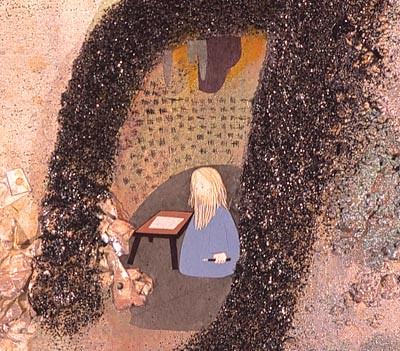
Then in 1998 she was invited to participate in a museum show in Switzerland in which they said she could do whatever she wanted. She visited the space and decided she should have a painting in the corner, not centered on any of the walls. This dark green rectangle was her first spray piece and one of the exciting things she learned making it was that the corner would disappear - "I was creating an illusionistic space within the built space".

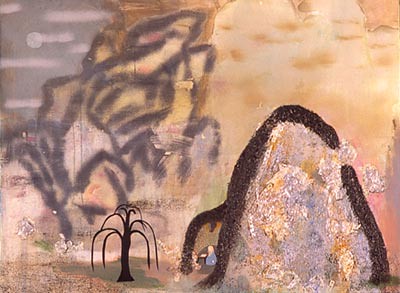
As an artist-in-residence at Marfa she was able to make a work that related to the whole building. The exciting discovery here was in painting over the door in the middle of the wall and making a painting you could "walk through" (I'm starting to think of James Hyde and his handles - another painter whose work seems to want to take us somewhere). The door in the Marfa building is a very specific door - not your generic door - which lent the piece added narrative. Sort of ominous.

The other big thing learned painting over this door in Marfa was in painting over the door's handle - spraying over the handle left an after-image behind it. This was her first time to notice this time element adding effect.

Part 2