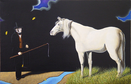
This small Matthew Fisher painting at ADA Gallery is so strong, from all the way across the gallery it commands your attention. The black is much shinier on the wall, the white horse more muscular. Everything is compacted and compressed, like a tensed muscle.
(you need to click on these paintings to see them best, they seem a little distorted here)

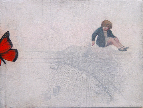
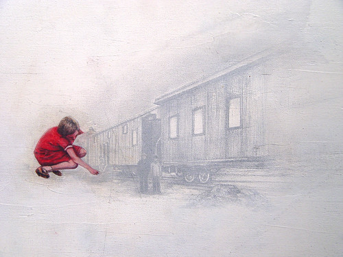
Steven Roebuck's newest paintings were such a surprise! The gloomy black glossiness is gone, replaced by a grainy, sandy, sweet white melancholy. You can't tell from these photos, but the canvas is attached very casually, much looser than the previous paintings, which as I recall often had claustrophobic frames. Or maybe they didn't, and that is just the way they felt - heavy black spaces hard to breathe in.
These are as quiet, still, and dreamy as the Matthew Fisher, but without that painting's ominous charged intensity. Not compacted and compressed, but loose and languid depictions of imagination and discovery.

Steven Roebuck.
P.S. - Kirstin Kindler is also showing at ADA right now, I will do a separate post on her next.


No comments:
Post a Comment