...

.
Showing posts with label ron johnson. Show all posts

Wednesday, March 14, 2012

Gary Snyder Gallery


Sven Lukin, Tucson, 1966

Gary Snyder Gallery, at Armory Show... in the Modern section... great booth. I liked it so much I later went to the gallery in Chelsea and saw a good Max Gimblett show.


Thomas Downing - ah okay, I am looking at my previous Armory posts and seeing I have featured this gallery before... Thomas Downing, at Armory w/Gary Snyder, 2009.


Ron Johnson??? Waht! Totally unexpected nice surprise. One of my favorite RVA artists.


(+ Gary Snyder represents Al Loving... another favorite)

Saturday, August 04, 2007

Ron Johnson


Ron Johnson has a website now.... I really like Ron's work... there are so many good artists in Richmond.

I wanted Ron to be in Art Basel: Stuffy's, but he didn't want to do it because he had another show happening - at Reynolds Gallery - around the same time. Ron and Kirsten were two that got away. They would have been so good together, and I think would have worked especially well with the Travis Conner, Don Crow, and my own stuff. Oh well... it was still a GREAT SHOW.


Here is my post on Ron's show from last September, featuring TWO special *guest-star* art critics (one in the post, one in the comments). Okay, Ron is getting his own label now.
PLUS: Judy has a Ron?!? HOW??? I want one too.

Tuesday, September 26, 2006

Ron Johnson


Ron Johnson is showing at Reynolds Gallery. Sorry about these photos, the color is much brighter in reality. Opening the door and seeing those two paintings on a bright day... they were very crayola.

These pieces are done on two or three sheets of layered mylar... the pooled paint could be on the front surface, on the reverse, or somewhere in the middle... also the drawing. They are hung a little bit off the wall, and the color I most noticed at the reception was the reflected oranges, purples, and yellows on the white walls behind the pieces. Kind of like light through stained glass.

The second visit was the one where I was struck by the bright crayola colors, and the scribbliness. These seem so refined, and then so child-like. They are also sort of creepy.. I start to see ghosts.. I don't know why but I start to think "cemetary", maybe because of all the orange and yellow Halloween stuff I'm seeing at the stores now. I've had this reaction before to Ron's colors though, thinking they were vampirish, from the batcave, and that was in a February.

The one above is like an orange skull.


Here is a ghost, rising up from a misty cemetary. Boo!

Ron Johnson
Upstairs are some pieces on panels. The one on the right is nice.


Like a body, but not a fresh one. A few days later... grey and leaking.

Ron Johnson
The strips that Ron uses... usually colored on one or both sides.


Thumbs-Up from Eric Sall! Really!

Sunday, November 20, 2005

big painting award

Didn't apply for this last year, but I wish I had. Maybe this year. Ron Johnson is one of the jurors!?

Ron also has a review in the current NYArts on the Paul Ryan show. Ron and Paul are both faculty in the VCU painting department and both are represented by Reynolds Gallery. Paul's wife Dinah wrote the Art Papers studio visit on Ron earlier this year (March/April 2005 issue), and Paul and Dinah together co-curated the Adaptation Syndrome show that Ron didn't belong in (even though his work was some of my favorite).

Paulette Roberts-Pullen on the Paul Ryan show for Style Weekly here.
Me on Paul Ryan here and here - with questions!

BONUS! - Here is an excellent collection of photographs of the Adaptation Syndrome show!

Saturday, September 10, 2005

Ron Johnson interviews Christian Bonnefoi in NYArts Magazine


Ron Johnson, originally uploaded by Bromirski.

Local painter Ron Johnson interviews Christian Bonnefoi in the current issue of NYArts Magazine.

Above is an image of one of Ron's paintings from last year, of which I'm a very big fan. It was dissapointing to see his latest at Reynolds Gallery earlier this summer. The new stuff was all the same shape and size, very generic, formulaic. No more pools of color, no canvas strips, no oily creepiness. Only one of them still had his glam vampire palette. What happened?

I hope those were just an experiment in monotony and the good stuff comes back.

Monday, March 07, 2005

Ron Johnson in ArtPapers

Dinah Ryan does a studio visit with Ron Johnson in the current issue of ArtPapers. Lots of references to baseball because for a time Ron had hoped to become a professional baseball player.

Three images are pictured, these are the same three pieces included in Adaptation Syndrome, the Ryan curated exhibit at the Hand Workshop Art Center.

If you haven't seen that show hurry up, it closes March 13th.

Have you read the three posts on the Adaptation Syndrome panel discussion? One, two, three. Part three is the Shocking Conclusion!!!

Monday, February 07, 2005

Adaptation Syndrome Panel

Went to the Adaptation Syndrome panel on Friday - lots to share.

Co-curator Dinah Ryan was at the lectern for about forty-five minutes before giving it up to husband Paul. An hour of explanation was more than enough.

Some quotes from Dinah include "artworks are indistinguishable from image production", "nobody's a visual virgin anymore", "to make an effective image one no longer has to be an artist", and something about the distribution of "broad-based wide-ranging intelligent and deliberate" images being "as big a shift as the Guttenberg press". The audience was asked to set aside all context, reasons, ideology, and politics while viewing images of custom cars, mouse hairs, space, cells dividing and satellite images of the recent tsunami and then told that "images that have nothing to do with artmaking" have "outclassed what artists are doing". Is there a term for this? Creating an artificial situation that attempts to force people to agree with you?

A comparison was made between a photograph of the mushroom cloud created after the bombing of Hiroshima with a photo of one of the planes hitting a WTC tower on 9/11 and something about one being a deliberately created image and the other not, one created for dissemination and one not. I'm a little confused here, my notes are bad, and I also think her breadth of knowlege might not extend far enough into WWII military history. That mushroom cloud was certainly intended to be seen and impress a message on the populace - more people were killed in a single night of firebombing Tokyo than from the atomic bombing of Nagasaki. She was just plain wrong in her belief that the atomic bombings were not an example of a "purposeful display".

Amazingly, after spending more than an hour trying to explain the concept of their show, Dinah said that included artist Ron Johnson was "not making deliberate reference to image" and that "he's an anti-image painter" whose "reflected shadows and colors militate against image". So what is he doing in your show??? Artist Margaret Evangeline later talked herself out of the curatorial concept when explaining her own working process.

I'll share more tomorrow.

Tuesday, February 01, 2005

Adaptation Syndrome III - Ron Johnson Plus

My other favorite work in the Adaptation Syndrome show is by Ron Johnson. Ron is showing three paintings, one of which I really like a lot and one which seems to be a failure - but an interesting failure because it seems he struggled with it, and that it might not be a failure at all but the beginnings of some change or possibly a new direction.

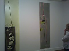
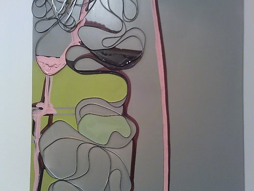
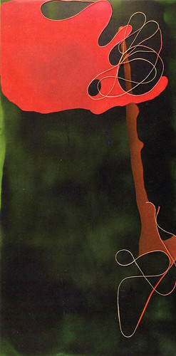
Unfortunately I can find no Ron Johnson images on the web to share, so I'll try to describe what his work usually looks like. He works flat on small panels or stretched silk, onto which he pours two to four pools of solid color that have a strange oil-slick quality. He probably waits a while before pouring another color because the slithery pools overlap but the colors don't mix. Weird colors and color combos, not exactly seventies, not exactly vampirish, somewhere in between. Did the 
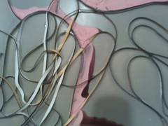
batcave have a kitchen? All of Ron's work also includes a thin cloth strip, no wider or longer than a shoelace, which I imagine he holds by one end as he lowers it onto the canvas and it curlicues around like the end of a colonial signature. The curlicued strips catch and hold pools of paint and can also be two-toned, hiding a color themselves that can only be seen from the side or upon close inspection.

Do you know how you are supposed to hold the brush when practicing Kanji? Vertical to the paper and with your fingers holding near the top or at the tip. So Ron's lowering of this canvas strip onto his painting is sort of like writing Kanji, with the "brush" lowering itself into the work. The piece that sticks out is called Elemental Return and is unusual because it both references landscape and Ron appears to have had second and third thoughts about including his signature strip. It was obviously laid down once and ripped up after the paint had dried, then it was laid down again in a different spot. Is he starting to get sick of feeling he has to add this strip everytime? Is he tired of abstraction? It is very interesting to note that Johnson studied under James Hyde - perhaps the original inspiration for the strips - and that Hyde's latest show at Brent Sikkema flirted with representation and landscape.

Margaret Evangeline and Rosemarie Fiore are also both included in this show, and so for the first time I consider the relationship between Evangeline's bullet riddled sheets of painted aluminum and previous works of Fiore's I've seen at ADA. Fiore has exhibited fireworks drawings - fireworks she's lit on paper - and gun rubbing mandalas.