Here's a link to an Art Newspaper article on the art market. Thanks Todd Gibson for the link and pulling the good quotes. Below is a quote from some sleazy dealer -
"If you make the business transparent it would collapse overnight. I have to have the option to lie to collectors about what’s available or quote them prices 10 times what other people paid. Entire careers are built upon fabrications, like about which shows sold out and at what prices"
Monday, May 30, 2005


HUGGUH
HUG - This was a total surprise. My photo's included so you might think I knew about it but the photo is actually something they had on file from a January 2004 Creation Story. Those two features along with last month's ADA review mean Style Weekly has been very good to me! Thanks Style Weekly!
GUH - I'm balancing out the above good press with a link to the smarmy Grammer Priss. He shore duz no a lot!
GUH - I'm balancing out the above good press with a link to the smarmy Grammer Priss. He shore duz no a lot!
spooky futamigaura
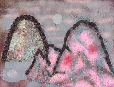
This is one of my Futamigaura inspired paintings. Futamigaura is a real place, the name of a beach in Ise, and the home of Meoto-iwa - the "Wedded Rocks" (I think most people just say Futamigaura though). I spent a month in Ise but never saw these rocks, it was only later on a visit to the Ota Museum in Tokyo that I saw Hiroshige's print and became aware of them.
Here are some other artist's versions - Shoda Koho here, Kawase Hasui here and here, somebody else here.
Someone just told me they look like the Pac-Man ghosts.
Friday, May 27, 2005
Hans Heiner Buhr
Through a comment on J.T. Kirkland's blog I've discovered the blog and work of Hans Heiner Buhr, a German artist living in Tbilisi, Georgia. His work is good and he's got some strong opinions - check out what he says about local artist Duane Keiser. He has also posted in the comments section to Kirkland's recent review of Kehinde Wiley on DCist. I'll excerpt -
"I think this is really the opposite of art- very bad art- no art at all. Sorry for the young artist, he has to start again. Wrong road for sure. I can not see any Tiepolo, Titian, Ingres or Raphael at all, but even if, that would be the wrong way too"
Some of the work he's posted on his blog reminds me a bit of the EXCELLENT Nancy Spero show of Vietnam era work I saw in NYC a while back. He's also got me thinking of Joy Garnett.
Best of all, I just love artblogs and how they are letting artists from all over become aware of each other's work and have conversations. Some of my favorite artists now are artists I have never seen in a glossy magazine or have had a Chelsea show. Wow.
"I think this is really the opposite of art- very bad art- no art at all. Sorry for the young artist, he has to start again. Wrong road for sure. I can not see any Tiepolo, Titian, Ingres or Raphael at all, but even if, that would be the wrong way too"
Some of the work he's posted on his blog reminds me a bit of the EXCELLENT Nancy Spero show of Vietnam era work I saw in NYC a while back. He's also got me thinking of Joy Garnett.
Best of all, I just love artblogs and how they are letting artists from all over become aware of each other's work and have conversations. Some of my favorite artists now are artists I have never seen in a glossy magazine or have had a Chelsea show. Wow.
Thursday, May 26, 2005
Photos of Recommendation: Thumbs-Up Mandala: Pat Adams
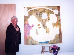
Pat Adams
Originally uploaded by Bromirski.
This is Pat Adams. Holy smokes! Some of her stuff looks like some of my meatballs!! Wow, she's pretty good!!!
Woah! She's using acrylic and sand and I'm using acrylic and sand!! Am I copying?!? I hereby want to announce due credit to Pat Adams! Something has rubbed off!
For you little people lovers - this is an awful photo of that painting but there are five little bearded men living in that painting's caves. They're trying to make it work!
(this thumbs-up photo is smaller than the previous ones, I'll try to make it bigger later)
CLARIFICATION: These thumbs-up photos are not of the artist with their work, but of the artist with my work. Please click on the links to see examples of the featured artist's work. Pat Adams is great.
Wednesday, May 25, 2005
Tom Harte
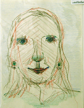
I was at World Cup a couple weeks ago and saw that the Dennis Matthews paintings have been replaced by the work of an artist named Tom Harte. The stuff at World Cup is kind of all over the place - he's got a mother and child, a vase of flowers, something completely abstract, some stylized drawings - and all more than a little amateurish looking except for one piece in particular which struck me as something I could imagine seeing at Zach Feuer's. It was a smallish portrait head of a woman with one cyclops-like eye and a rainbow-ray halo.
Less than a week later I was flipping through ADA Gallery's 12 by 12 racks and saw more Tom Harte portraits, very lovely and sweet. They're wonderful. These seem to be portraits of specific people, as opposed to Cyclopic Madonnas, and are real treasures. Don't they say that when you are looking at someone or something you really like your pupils dilate*? The woman in the drawing above must really love Tom Harte, her eyes are radiating.
Harte has left his initials and the completion date at the earrings of the portrait above but in this one he writes the woman's name, half at each lobe, and in this one he includes a little picture of a horse and cart over one eye and a fish over the other. Those things hard to see or notice, sorry, but they're hard to notice in "real life" too. Here's the final one I got a picture of.
I don't know anything about Tom Harte or his history/education, but I'm thinking he's a bit of an outsider artist. Some of the work is dated as far back as 1994 ( like the piece above) and his pricing makes no sense. The small drawings I mention seeing at World Cup are $100 but the nice Cyclops painting is only $50, and all his 12 x 12 works-on-paper at ADA are also $50. Whatever the case, these portraits are very good.
*I just looked it up - it's called pupillometrics.
Jerry Saltz's Daniel Buren review
Jerry Saltz has a review of Daniel Buren's Guggenheim installation. Read it here.
I blogged Buren's recent lecture - part one here and part two here. I'll probably update this post with more Buren info/gossip later.
He hates the Christo's!
I blogged Buren's recent lecture - part one here and part two here. I'll probably update this post with more Buren info/gossip later.
He hates the Christo's!
Tuesday, May 24, 2005
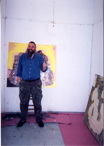
Cultural Creative
I took this test I saw on Cynthia King's blog Fresh Paint. I'm a "Cultural Creative", she's a "Postmodernist". What are you?
You scored as Cultural Creative.
Cultural Creatives are probably the newest group to enter this realm. You are a modern thinker who tends to shy away from organized religion but still feels as if there is something greater than ourselves. You are very spiritual, even if you are not religious. Life has a meaning outside of the rational.
Cultural Creative - 81%
Materialist - 75%
Existentialist - 69%
Postmodernist - 63%
Modernist - 50%
Romanticist - 50%
Idealist - 44%
Fundamentalist - 25%
Cynthia chose a strange Milton Avery as her favorite painting last week. Check it out.
You scored as Cultural Creative.
Cultural Creatives are probably the newest group to enter this realm. You are a modern thinker who tends to shy away from organized religion but still feels as if there is something greater than ourselves. You are very spiritual, even if you are not religious. Life has a meaning outside of the rational.
Cultural Creative - 81%
Materialist - 75%
Existentialist - 69%
Postmodernist - 63%
Modernist - 50%
Romanticist - 50%
Idealist - 44%
Fundamentalist - 25%
Cynthia chose a strange Milton Avery as her favorite painting last week. Check it out.
Timothy Michael Martin
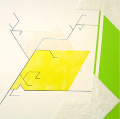
This is one of Timothy Michael Martin's pieces in the current show at ADA Gallery. I can't believe the month is almost over and there is so much local art I haven't shared! Maybe I'm getting selfish on my blog. I'll try to spend more time writing about other people's art.
Also included in this ADA show are Buxton Midyette and Chris Norris. I'll go back tomorrow or Wednesday and post something. I think the piece pictured above is my current favorite Mike Martin piece - let's trade!!
Please feel free to share your thoughts or plug/criticize in the comments.
Monday, May 23, 2005
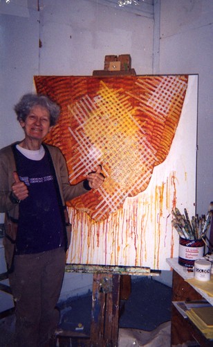
Daniel Buren lecture II
- this is the second posting of the Daniel Buren lecture. The first post is here.
A Belgian gallery asked Buren to show with them in the early 70's(?) . He accepted and requested that the gallery a. choose the single color for the announcements and b. don't send them. The gallery made a lot of red announcement cards and when Buren arrived he posted a trail of them to the outside wall of the gallery building like breadcrumbs right up to the gallery's entrance. The trail continued around the door and along the gallery's interior walls. He showed at that same gallery another year and did the exact same thing with yellow cards, another year with blue cards, each year another color and another memory of place and color. That line of colored cards is echoed in the green stripes of the current Guggenheim installation.
Buren then began a kind of unprompted defense of his work - "when people want to make an easy critique of my work... it's true ... you can say that, but if you want to be serious you can't say that". Nobody had said anything (as far as I could tell), so this may have been prompted by some past criticism of that Belgian piece. He next showed a selection of his LA bus stop bench images. I think this was in relation to the above defense.
I've just looked at I think every Daniel Buren image on the internet and am disappointed that I can't find any photos of so much of his work. Lots of photos on artnet of things you can buy at galleries but no photos of the above-mentioned LA bus stop bench pieces (UPDATE: found some!) and I'm really surprised and disappointed not to find any photos of two big wild projects he talked about in his lecture. One was a large vaulted interior space - filled with columns and arches - under which he painted black and white stripes. A platform/floor diagonal to the space was installed which was then covered with mirror. The space received sunlight from windows along the top of the wall and the mirrored tilted floor doubled the architecture and doubled the light. All the columns and arches became circles and elongated ovals, sunshine shone from the ceiling and floor. Very disorienting, very Piranesi or Escher.
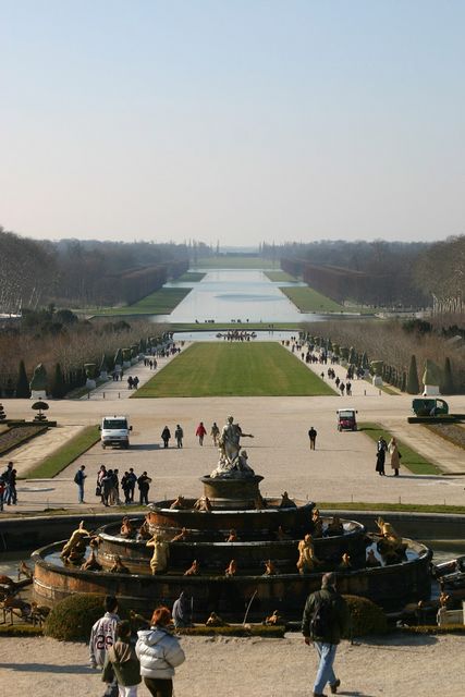
The other big project I can't believe I can find no images for was a September 2004 project done at Versailles. If you look at this photograph you will note that after the fountain and long expanse of green grass the landscape seems to tilt up. That blue/gray space beyond is water (here it is at a more direct angle). Buren said that this photo is taken from what the king himself viewed, "the way to view my park in Versailles" - "everything you see is completely false, created with geometry and trompe l'oeil". Buren showed us a photo of his Versailles project taken from this "king's view" and we saw what looked like a large black and white striped gate or window at the beginning of the long expanse of grass, framing the view of the lawn (something similar to this older piece but much larger). In fact, we learned from seeing shots at other angles that Buren's piece was not vertical at all but that his stripes (white only) were pieces of wood laid along the length of the entire lawn. From the king's angle view it looked like a vertical gate. It's hard to explain, sorry I have no pictures.
Buren - "All of these laws are false. They are a specific organization. They are not natural. On the right and left (of the king's view of the garden) you can lose yourself, but in the king's view the law was untouchable. Exept this law was false. It was a complete construction. As soon as I realized tht the full garden was done with very false perspective... I returned the perspective."
A Belgian gallery asked Buren to show with them in the early 70's(?) . He accepted and requested that the gallery a. choose the single color for the announcements and b. don't send them. The gallery made a lot of red announcement cards and when Buren arrived he posted a trail of them to the outside wall of the gallery building like breadcrumbs right up to the gallery's entrance. The trail continued around the door and along the gallery's interior walls. He showed at that same gallery another year and did the exact same thing with yellow cards, another year with blue cards, each year another color and another memory of place and color. That line of colored cards is echoed in the green stripes of the current Guggenheim installation.
Buren then began a kind of unprompted defense of his work - "when people want to make an easy critique of my work... it's true ... you can say that, but if you want to be serious you can't say that". Nobody had said anything (as far as I could tell), so this may have been prompted by some past criticism of that Belgian piece. He next showed a selection of his LA bus stop bench images. I think this was in relation to the above defense.
I've just looked at I think every Daniel Buren image on the internet and am disappointed that I can't find any photos of so much of his work. Lots of photos on artnet of things you can buy at galleries but no photos of the above-mentioned LA bus stop bench pieces (UPDATE: found some!) and I'm really surprised and disappointed not to find any photos of two big wild projects he talked about in his lecture. One was a large vaulted interior space - filled with columns and arches - under which he painted black and white stripes. A platform/floor diagonal to the space was installed which was then covered with mirror. The space received sunlight from windows along the top of the wall and the mirrored tilted floor doubled the architecture and doubled the light. All the columns and arches became circles and elongated ovals, sunshine shone from the ceiling and floor. Very disorienting, very Piranesi or Escher.
The other big project I can't believe I can find no images for was a September 2004 project done at Versailles. If you look at this photograph you will note that after the fountain and long expanse of green grass the landscape seems to tilt up. That blue/gray space beyond is water (here it is at a more direct angle). Buren said that this photo is taken from what the king himself viewed, "the way to view my park in Versailles" - "everything you see is completely false, created with geometry and trompe l'oeil". Buren showed us a photo of his Versailles project taken from this "king's view" and we saw what looked like a large black and white striped gate or window at the beginning of the long expanse of grass, framing the view of the lawn (something similar to this older piece but much larger). In fact, we learned from seeing shots at other angles that Buren's piece was not vertical at all but that his stripes (white only) were pieces of wood laid along the length of the entire lawn. From the king's angle view it looked like a vertical gate. It's hard to explain, sorry I have no pictures.
Buren - "All of these laws are false. They are a specific organization. They are not natural. On the right and left (of the king's view of the garden) you can lose yourself, but in the king's view the law was untouchable. Exept this law was false. It was a complete construction. As soon as I realized tht the full garden was done with very false perspective... I returned the perspective."
Sunday, May 22, 2005
Photos of Recommendation: Thumbs-Up Mandala: Peter Halley
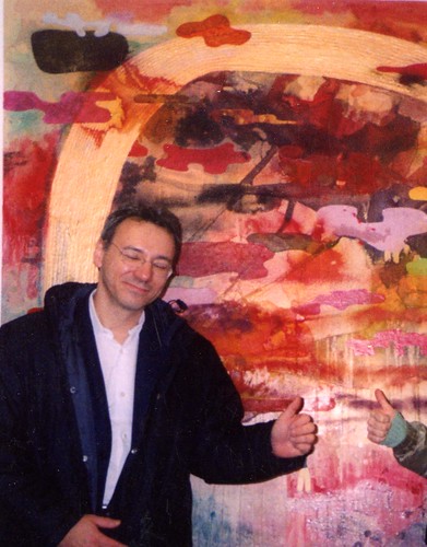
Okay, I'm going to post some photos this week from the Thumbs-Up Mandala mentioned in the comments section of last week's touched by Daniel Buren post. This is Peter Halley.
Friday, May 20, 2005
Jon Clary
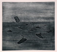
Here's a nice print by master printmaker Jon Clary. A spooky meeting of Manet and H.C. Westermann, maybe somewhere in the Bermuda Triangle. I saw last week that Jon was selling his Paris Hilton prints for $5.00, but I bought one last year for $10.00!
The market is crashing!!!
Katzen Arts Center @ American University
Jack Rasmussen, director/curator of American University's in-progress Katzen Arts Center, has a blog documenting it's development and including a general call for entries. The call isn't for a specific exhibition and there is no deadline, I think they are just interested in seeing what is out there.
Overwhelm him!!
Overwhelm him!!
Thursday, May 19, 2005
Options 2005 latest
(UPDATED at bottom)
Couple of new comments posted here today from artists who had studio visits scheduled for this weekend with Libby Lumpkin. She's sick and has cancelled. They're not happy. Are the visits cancelled altogether or just postponed?
I'd like to know how many local artists applied and how many of them made it to the studio visit round. Does anybody know of a non-VCU grad that had a visit or had one scheduled?
(L.L. - get well soon)
Relatedly, somebody named marye has left an interesting question/comment on the last Whitney Biennial 2006 post. She(?) doesn't like the idea of submissions at all and thinks that they cloud the curator's job - "to seek out and gather under one roof art of note". What does that mean? It seems to me like so many of them only look at what an institution is paying them to look at.
Case in point: I'm a fan of Ingrid Schaffner's work at the Philadelphia ICA and contacted her last fall when I heard she would be speaking at VCU in October. I invited her to visit my studio while she was in town and she wrote back (nicely) that she wanted to focus her time on the work at VCU. Fair enough, but when I later find out that almost half of the VMFA Professional Fellowship winners are students who had studio visits with Ms. Schaffner (the juror) I want to puke.
Hilarious insider aside: A grad who passed on his visit with Schaffner gave his slot to an undergrad friend. That's the undergrad who won one of the professional fellowships! As far as I can tell, the two grads that didn't have studio visits with Schaffner are the two that didn't win fellowships.
UPDATE 5/20/05: an article on Corcoran problems in today's Washington Post. I don't know if this is related to Ms. Lumpkin's cancelling the visits or not, but it seems commenter former MICA grad was right about the money problems.
RELATED?: Speaking of curators and money and the need for transparency - a Getty Museum senior curator has been indicted in Italy.
Vittorio Colaizzi
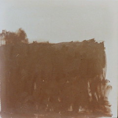
VMFA Professional Fellowship recipient Vittorio Colaizzi has sent me a more recent image of his work than what I linked to in my previous post announcing the award winners (22 comments on that post right now).
This untitled piece from 2004 is approx. 20 inches square, oil on canvas. Thanks for sharing, Vic, and congratulations.
Wednesday, May 18, 2005
a favorite from abroad
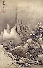
Sesshu is a favorite from abroad. Can you see the little figure on the steps? Here is a bigger and better image of it. Actually, just go to this page and click on the thumnbails to see some great reproductions. Awesome.
If I could figure out how to post two photos to one blog entry I'd have probably posted this one also. He was seventy-seven when he did it.
a favorite
moses 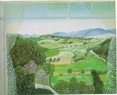
Originally uploaded by Bromirski.
Others are posting their favorite paintings. Here's one of my favorite paintings - I think it's called Hoosick Valley From My Window - by my favorite artist, Anna Mary Robertson Moses, a.k.a. Grandma Moses. Other favorites are Spring Snow, Thunderstorm, Hoosick Falls In Winter, Hoosick River In Winter, and Rainbow (her last one). Actually, I like almost all of them.
I'm from Hoosick Falls!
Originally uploaded by Bromirski.
Others are posting their favorite paintings. Here's one of my favorite paintings - I think it's called Hoosick Valley From My Window - by my favorite artist, Anna Mary Robertson Moses, a.k.a. Grandma Moses. Other favorites are Spring Snow, Thunderstorm, Hoosick Falls In Winter, Hoosick River In Winter, and Rainbow (her last one). Actually, I like almost all of them.
I'm from Hoosick Falls!
Tuesday, May 17, 2005
good news for VMFA
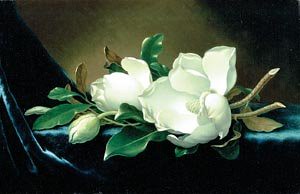
"The Virginia Museum of Fine Arts announced last night that it is receiving a gift of $100 million in money and 19th- and 20th-century art from collectors James W. and Frances G. McGlothlin."
What is your favorite work currently in the VMFA? Do you think the museum has any pilgrimmage pieces? Something that people travel to Richmond to see?
I like the little Manet and a couple of the no-name Dutch paintings but I don't think they currently have anything that motivates people to make a trip to Richmond. Getting this gift is great.
Thank you to James W. and Frances G. McGlothlin.
Subscribe to:
Posts (Atom)